Fullscreen prototype to view the entire page
Project Background
What is Apex?
Apex is a software company based in England that has developed the Scribe App, a digital floorplan and 3D modeling software that runs through Unity. Apex’s focus is creating engaging software that focuses on ease of use, saving the users time and resources, and increasing productivity.
Contact for Apex:
Our contact for Apex was Patrick Kape, co-owner, and director of Apex, who came to us with several options of what needed to be redesigned for the evolution of their modeling tool.
Scope of Project:
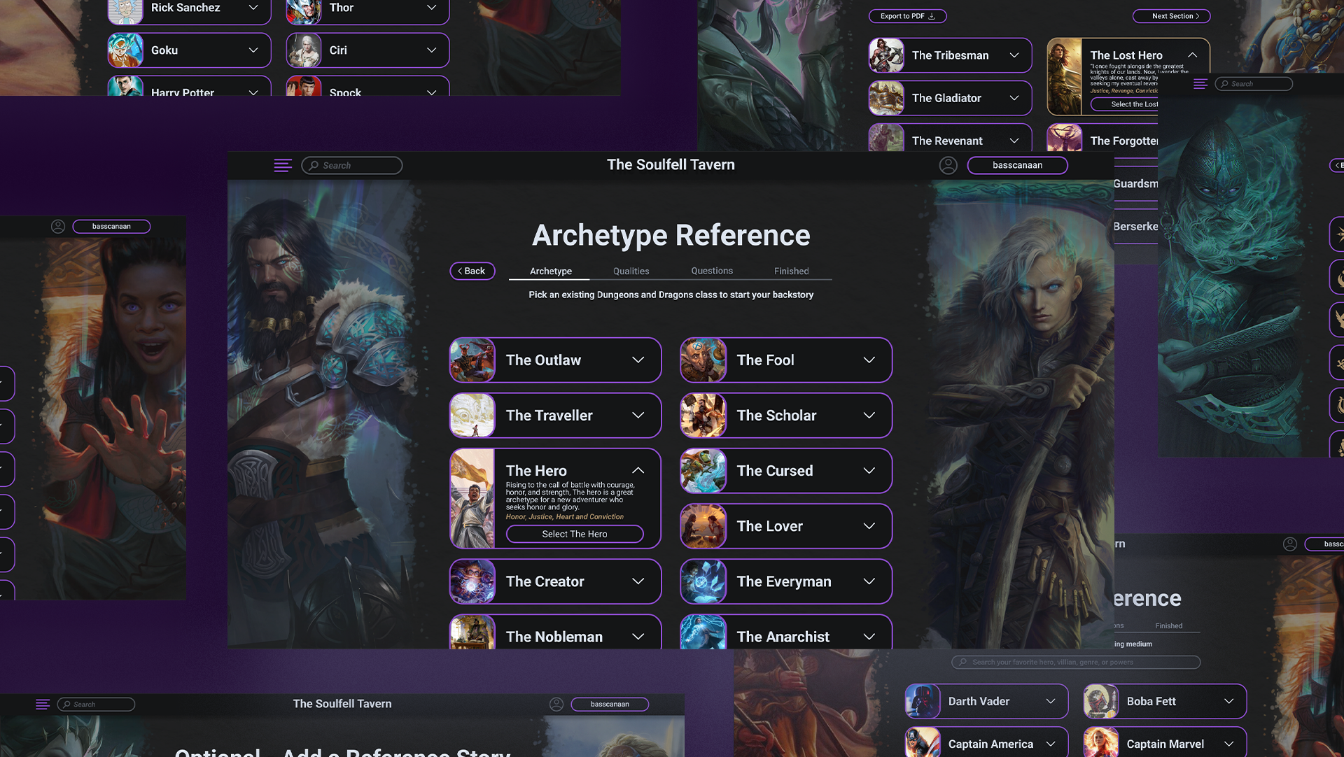
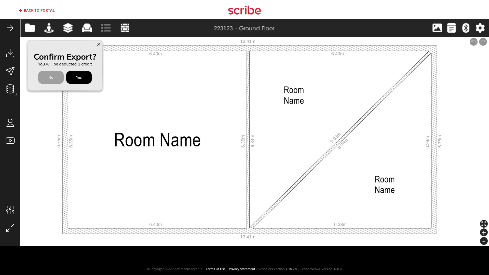
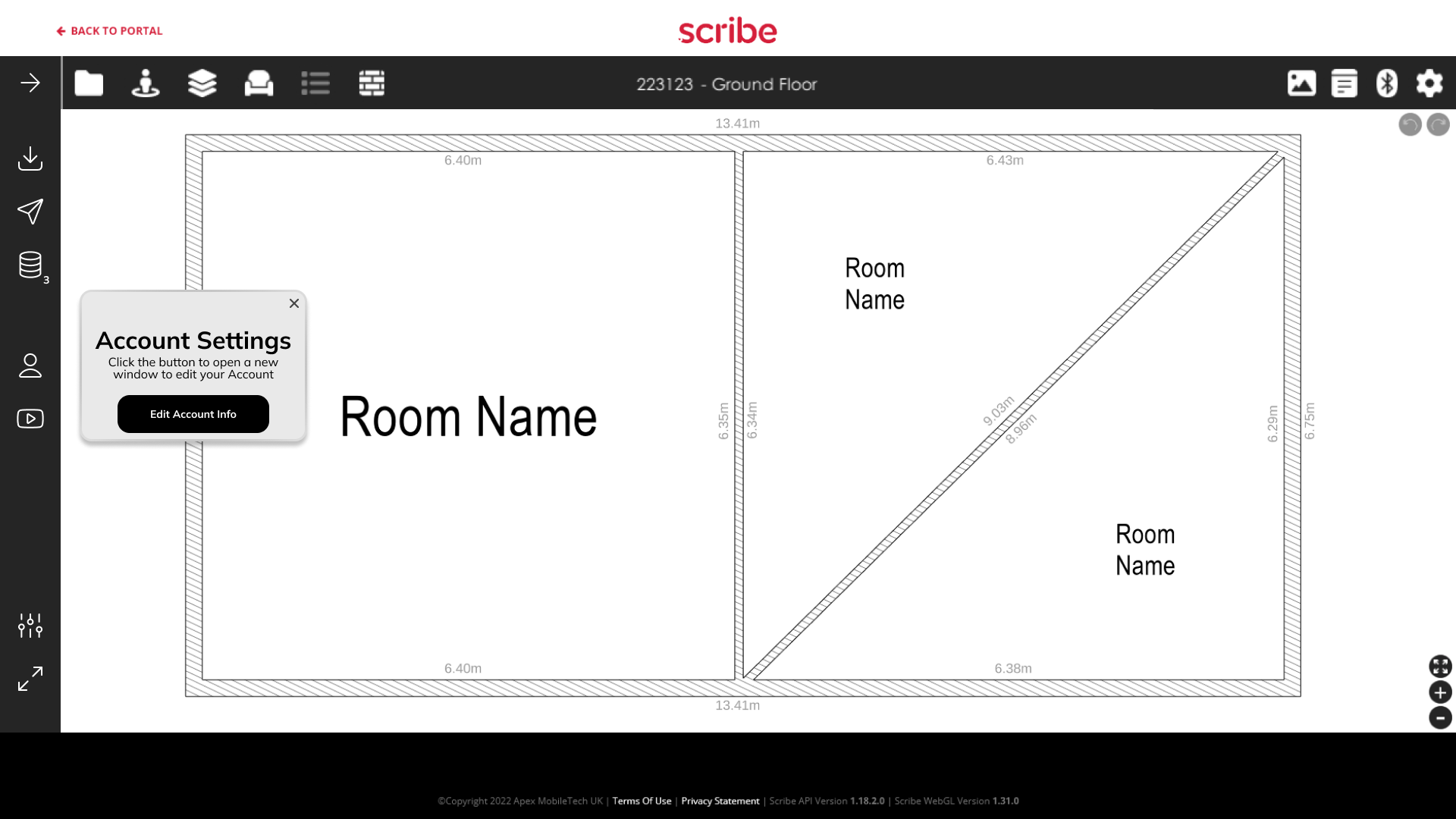
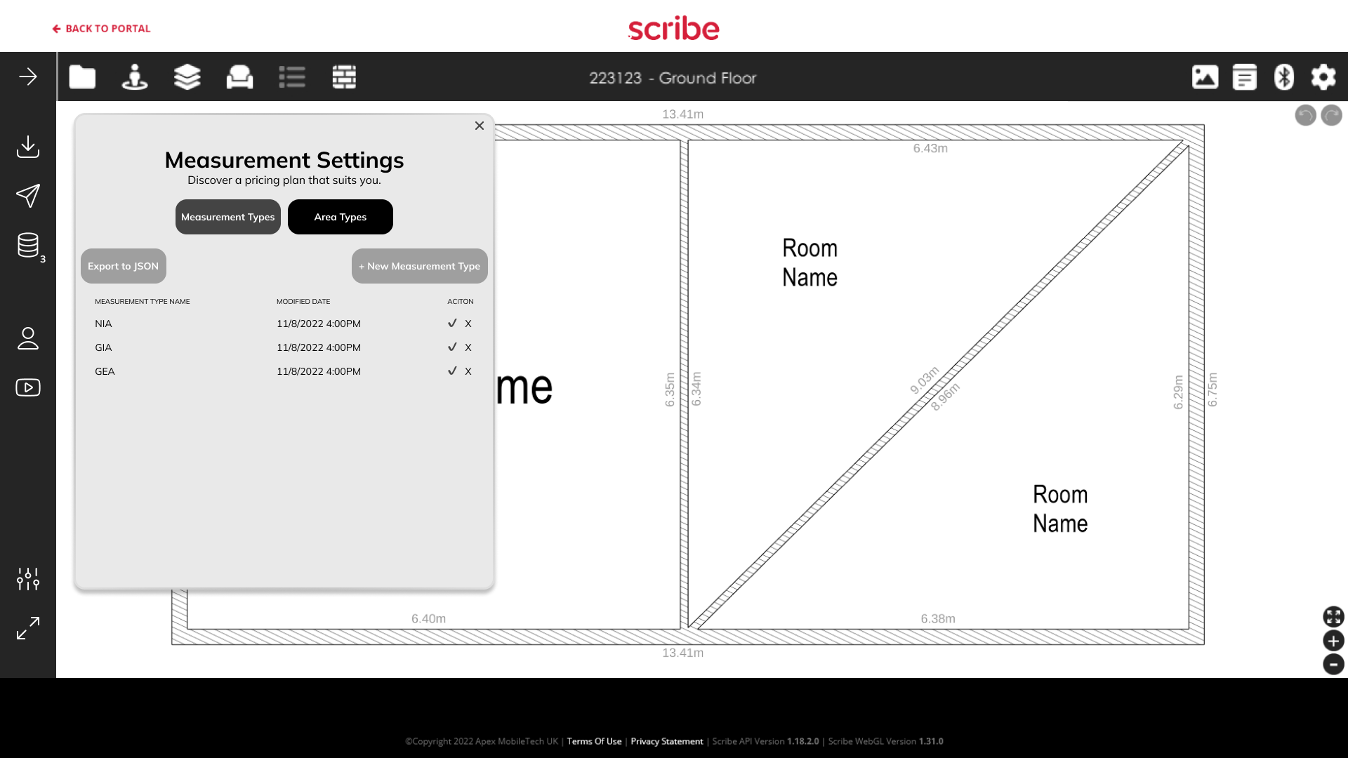
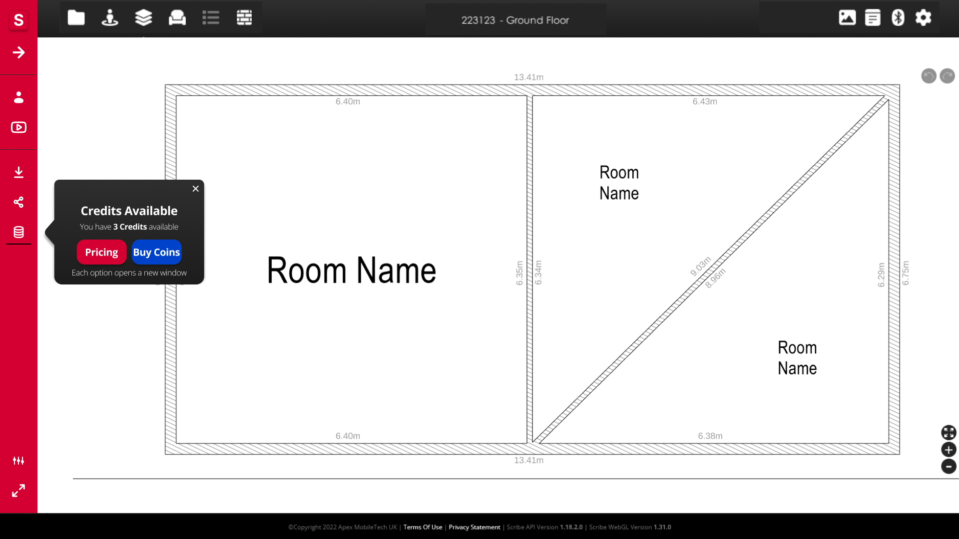
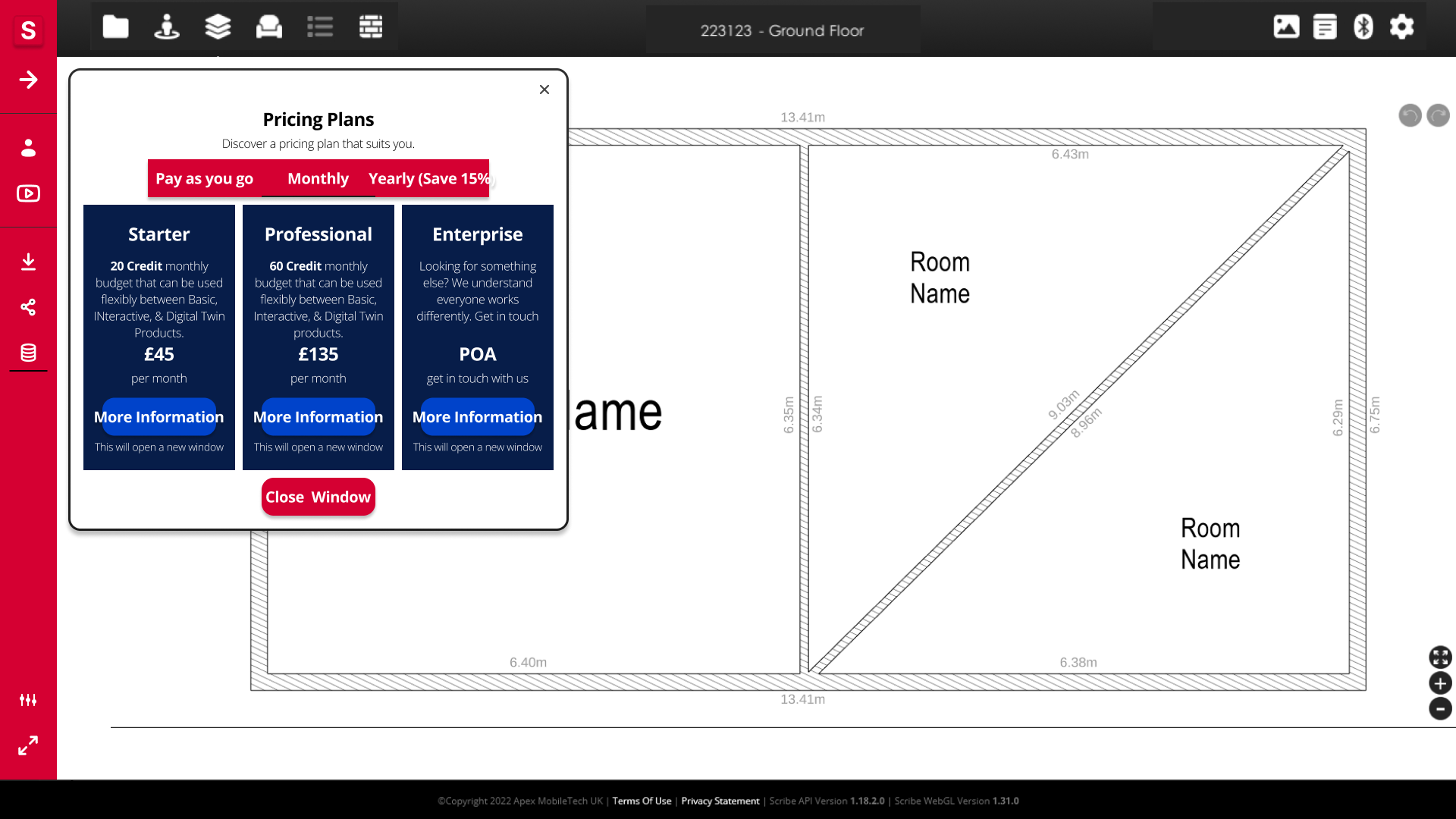
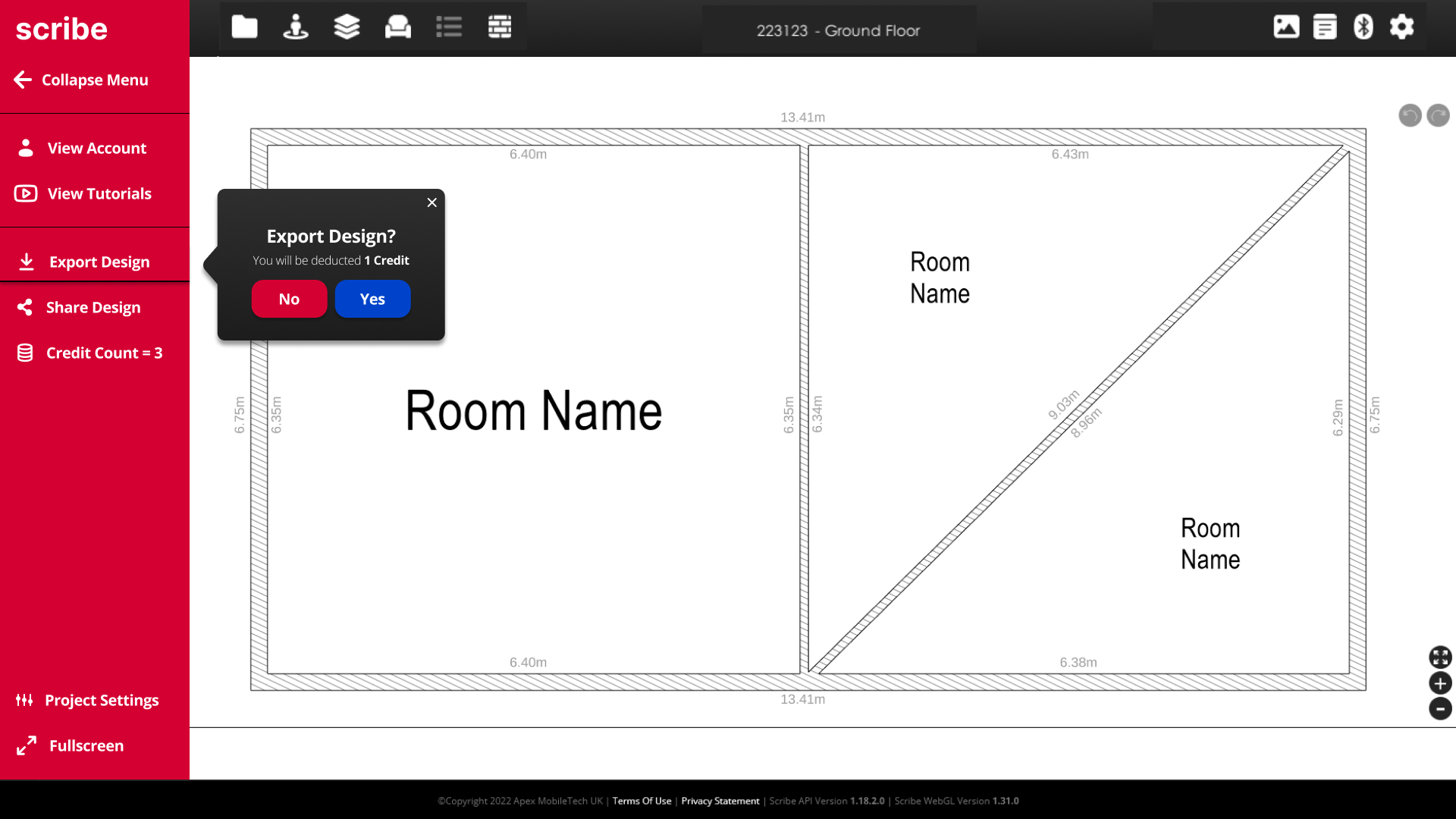
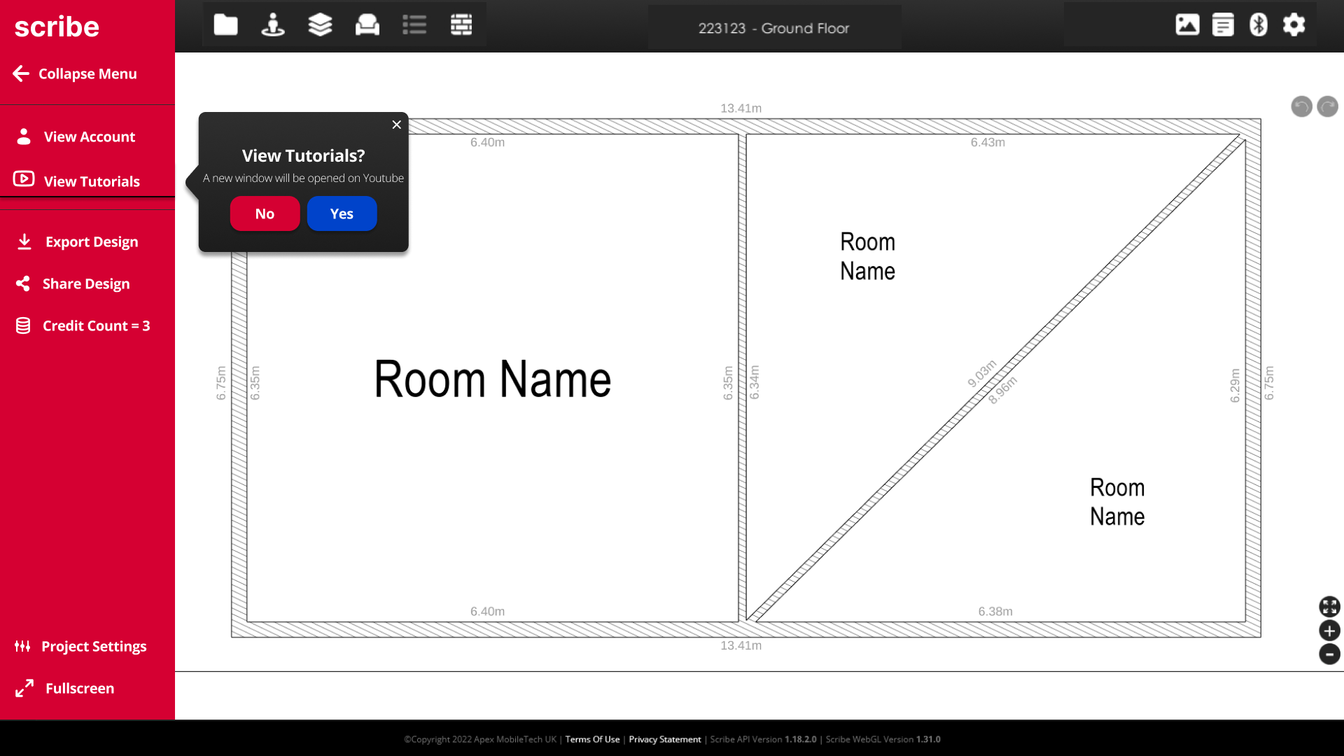
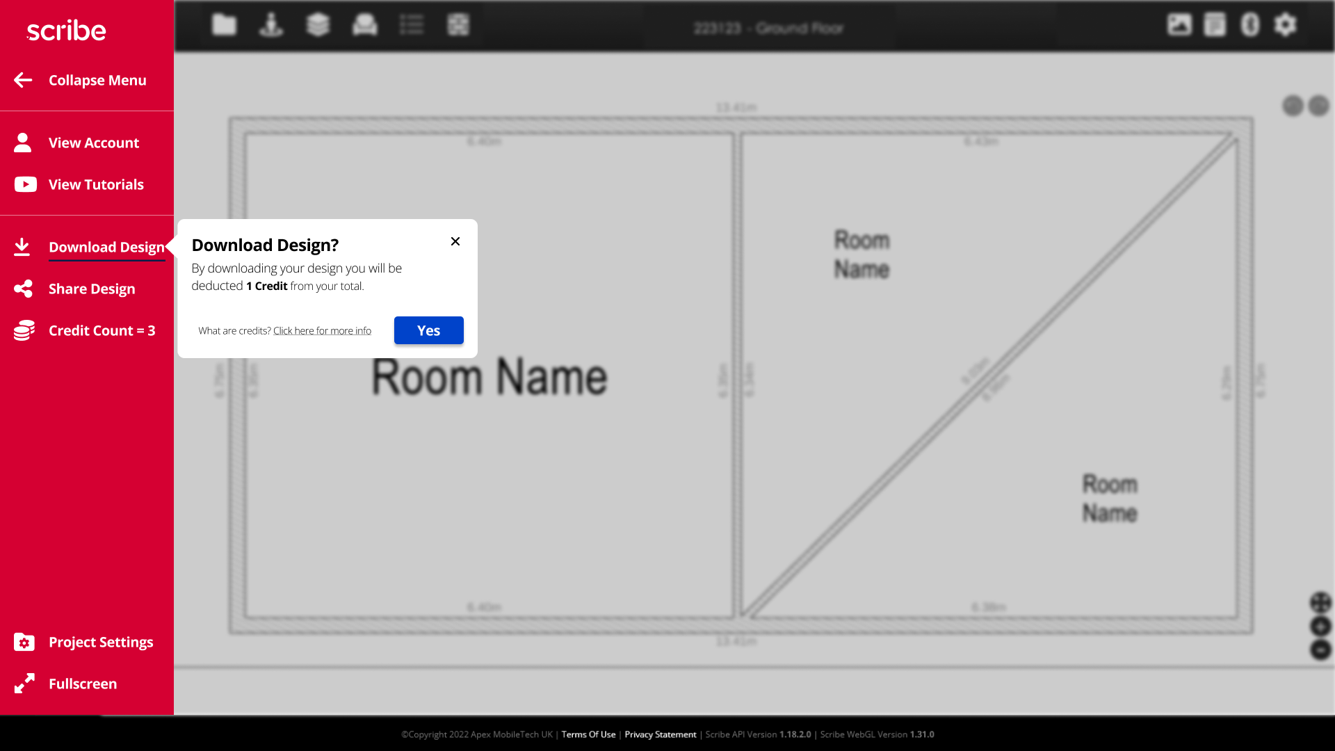
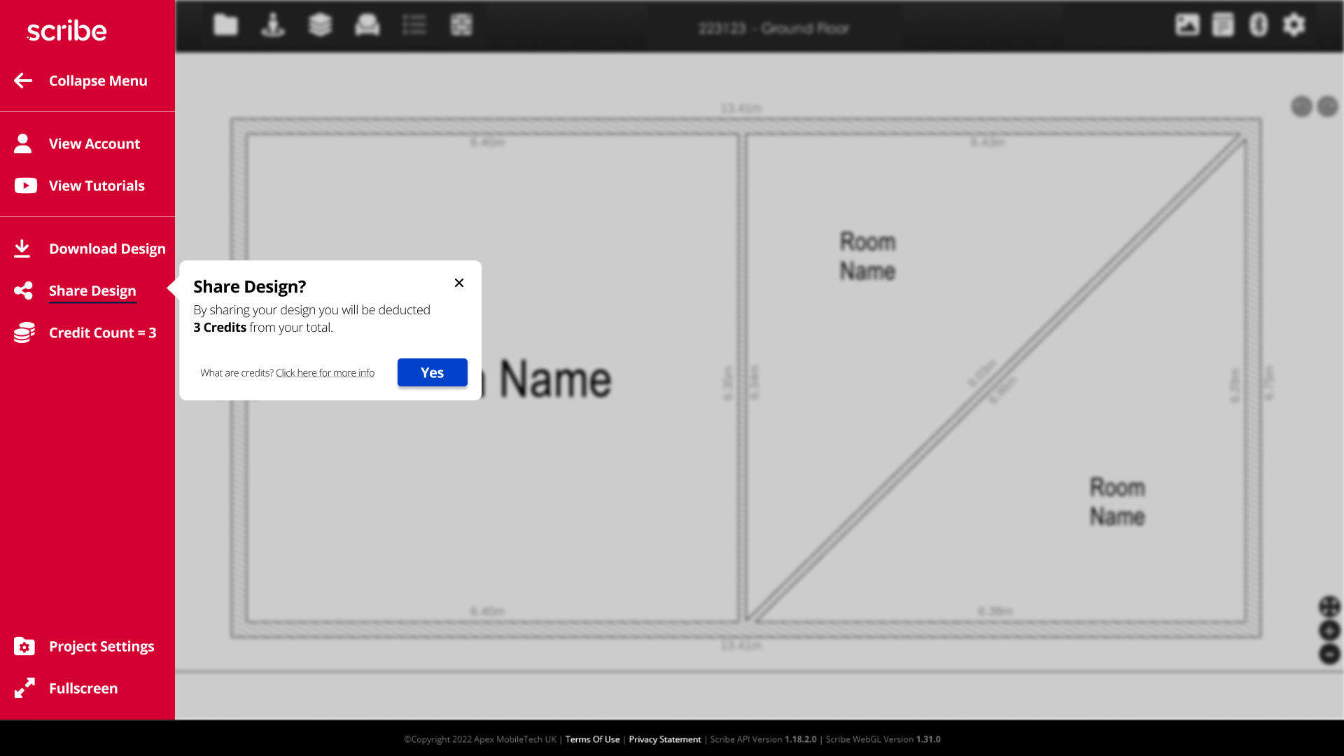
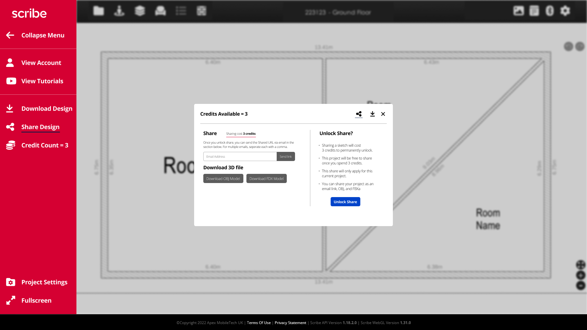
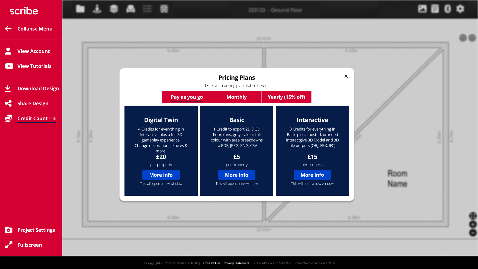
It was agreed that we would work on redesigning the web toolbar to ease the user experience of exporting and sharing designs, purchasing coins, and finding more information regarding their account, files, and tutorials.
Apex currently focuses on:
Business to Business commerce (wants to expand to B2C and other clients)
Plug a gap in the market between low-quality floor plan modeling programs and top-end AutoCAD software that require a lot of investment
Replicating assets and features that architectural programs use but removing the barries to entry (cost, heavy training, time investment)
The goals for the business are:
Increase the ease of use for new and old users
Consistent design themes across the site and navigation
Increase understanding of icon and program functions
User research and analyzing the competition
Patrick provided us with some information regarding their competitive research practice and we were able to fill in the blanks by looking at some other AutoCAD programs.
Free or cheap modeling programs were:
- Poorly designed and low quality
- Easier to understand but extremely limited in capabilities
- Limited sharing and exporting capabilities
AutoCAD or expensive modeling programs were:
- Better designed but had an overwhelming amount of icons
- Much harder to understand but had a high ceiling of possibilities
- Requires a large time investment, but sharing potential is greater with OBJ and FDX files

Initial version of Scribe app

User personas - The Houseflipper/DIY:
Three user personas were already established by Apex, however, our team developed a new user persona to better understand the Minimum Value Product that would need to be reached. This new user persona represented the Business to Consumer market that Patrick was wanting to break into, and informed our design decisions as we believed that if someone with little to no experience could understand the user flow, then the established user personas who did have experience with modeling software would easily be able to integrate Scribe into their toolset.
The Houseflipper / DIY:
The Houseflipper/DIY is a smaller business owner or individual who is looking at making large changes on their property. They are looking to make changes to their property without a large overhead, increase their profit while creating minimal labor outsourcing, and stay within their small-scale budget.
Pain Points:
Difficult to stage a house without visualizers or architectural resources
Little to no experience with modeling software, creating potential issues and potential for problematic situations to arise
Hard to estimate some costs regarding a property without modeling software
Goals:
Make time-efficient renovations and plans
Find tools and resources that ease pain points in remodeling
Work by their own means and not outsourcing
Design Goals
Initial version of Scribe app
High-level goals:
- Design a modern and efficient navigation system for the web elements of the Scribe app (no redesign to the unity software)
- Update icons to be more clear and unique to decrease confusion
- Update designs and colors to match the dev version of the software
Brand design:
The key motifs that Apex focused on for the dev version:
- Modern and accessible design
- Bold red, black, and white color scheme
- Ease of use and not overwhelming users
Fonts were updated to match the software across the board, instead of having several different font families that were on previous designs.
Icons were chosen to stand out and were updated so that there were no repeating icons that could be misinterpreted (different than the original designs that used the same settings icon for multiple types of settings for example).
Low Fidelity Designs
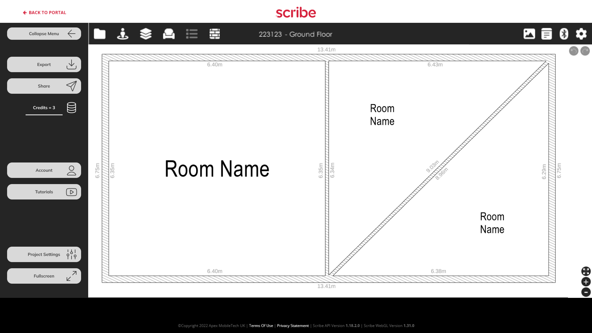


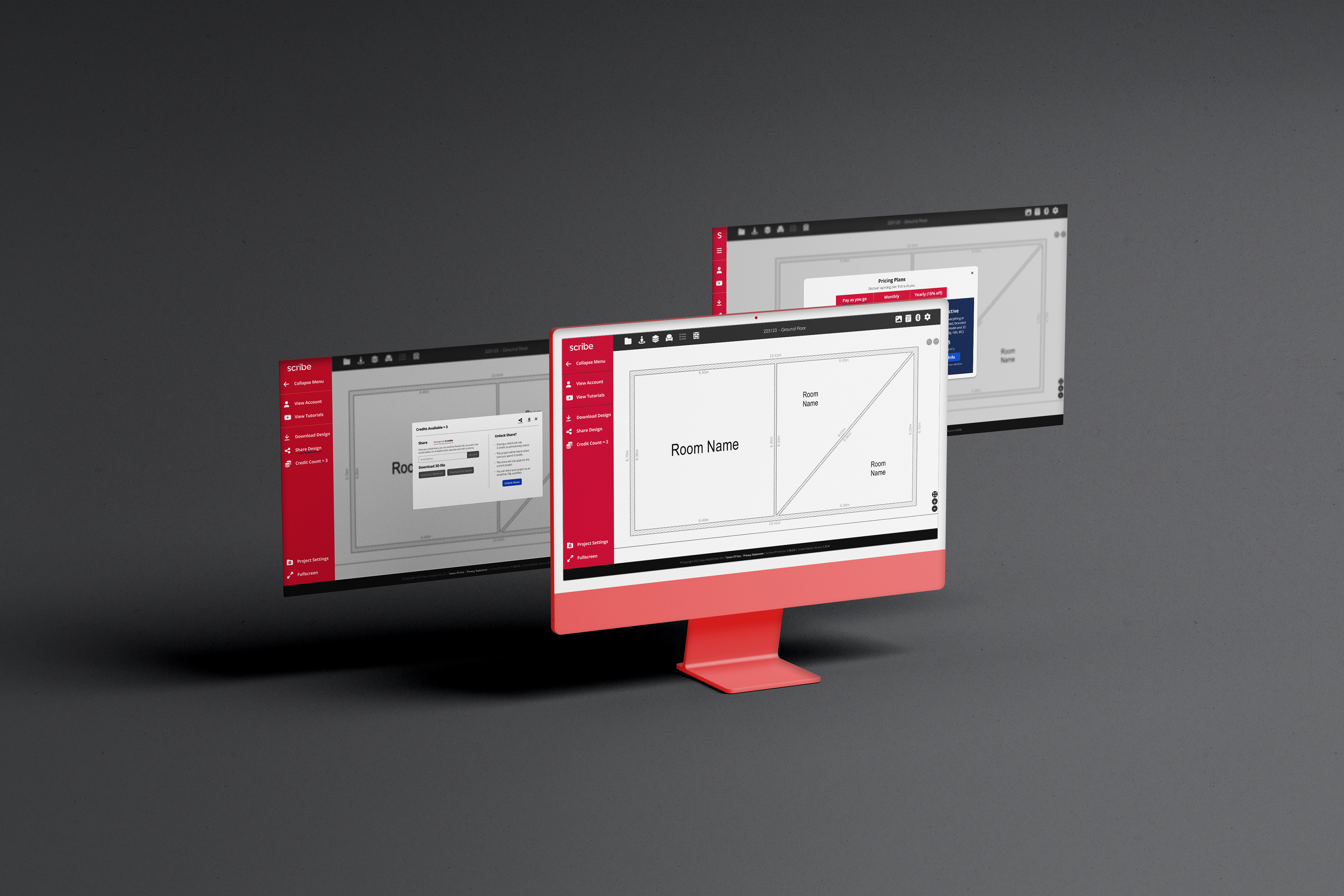
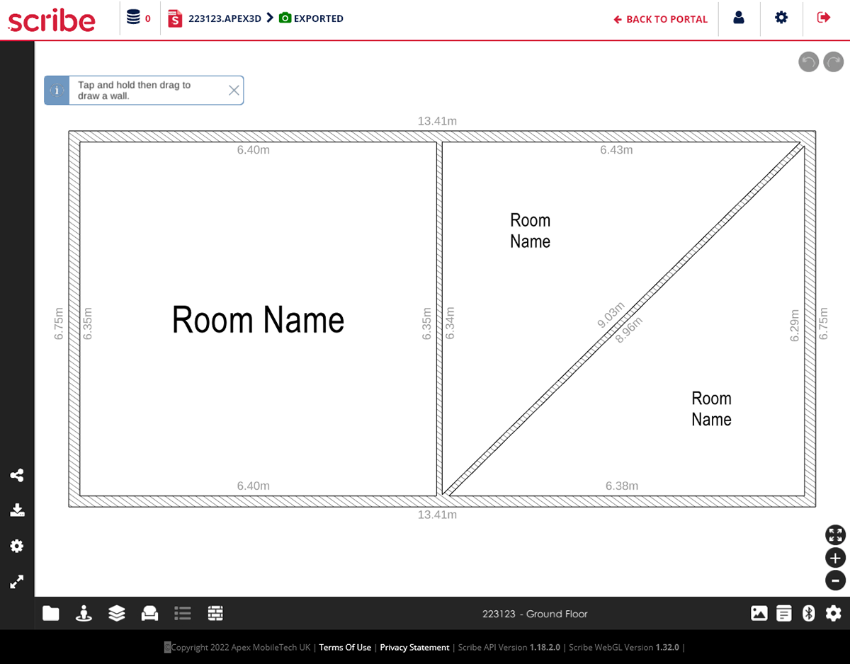
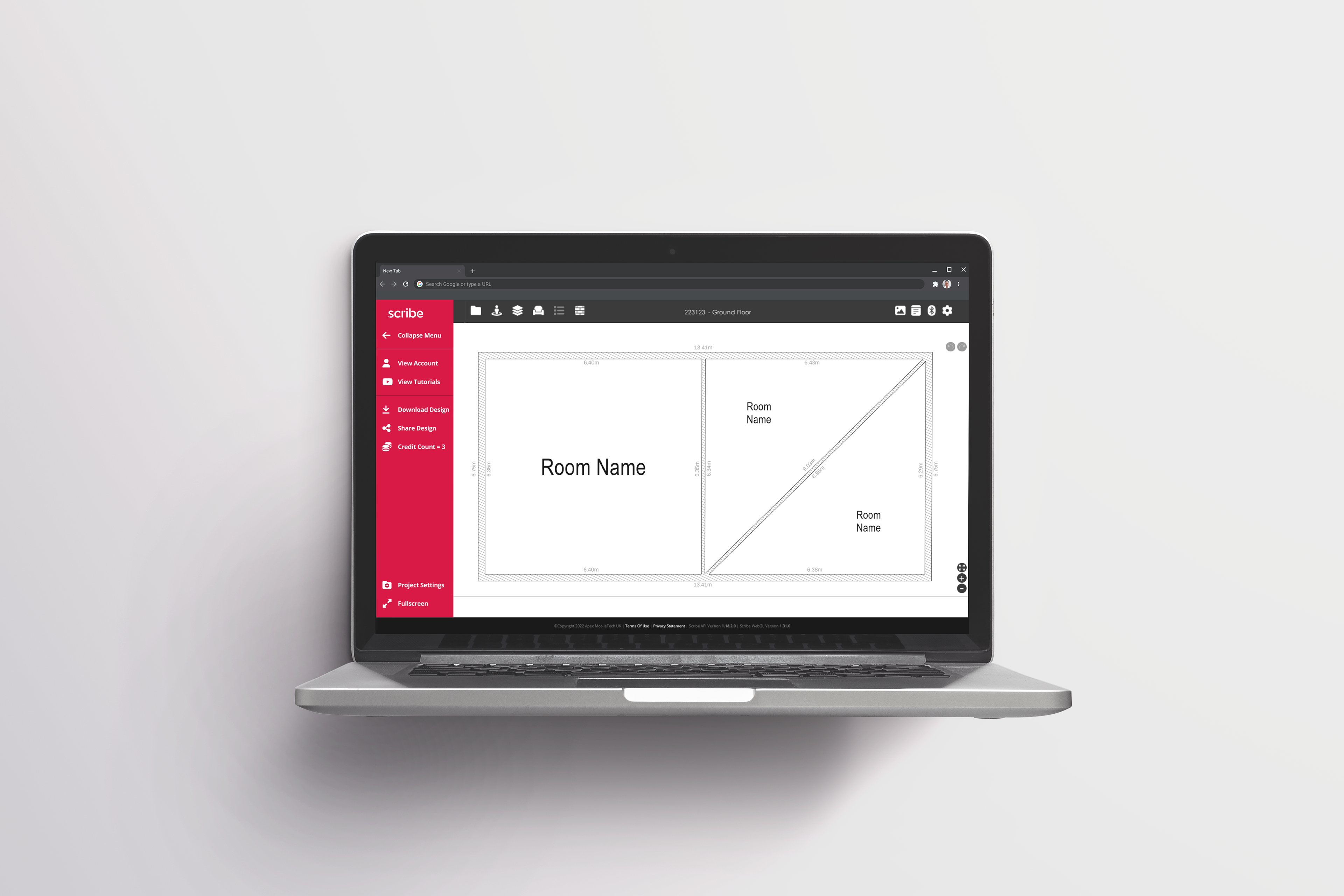
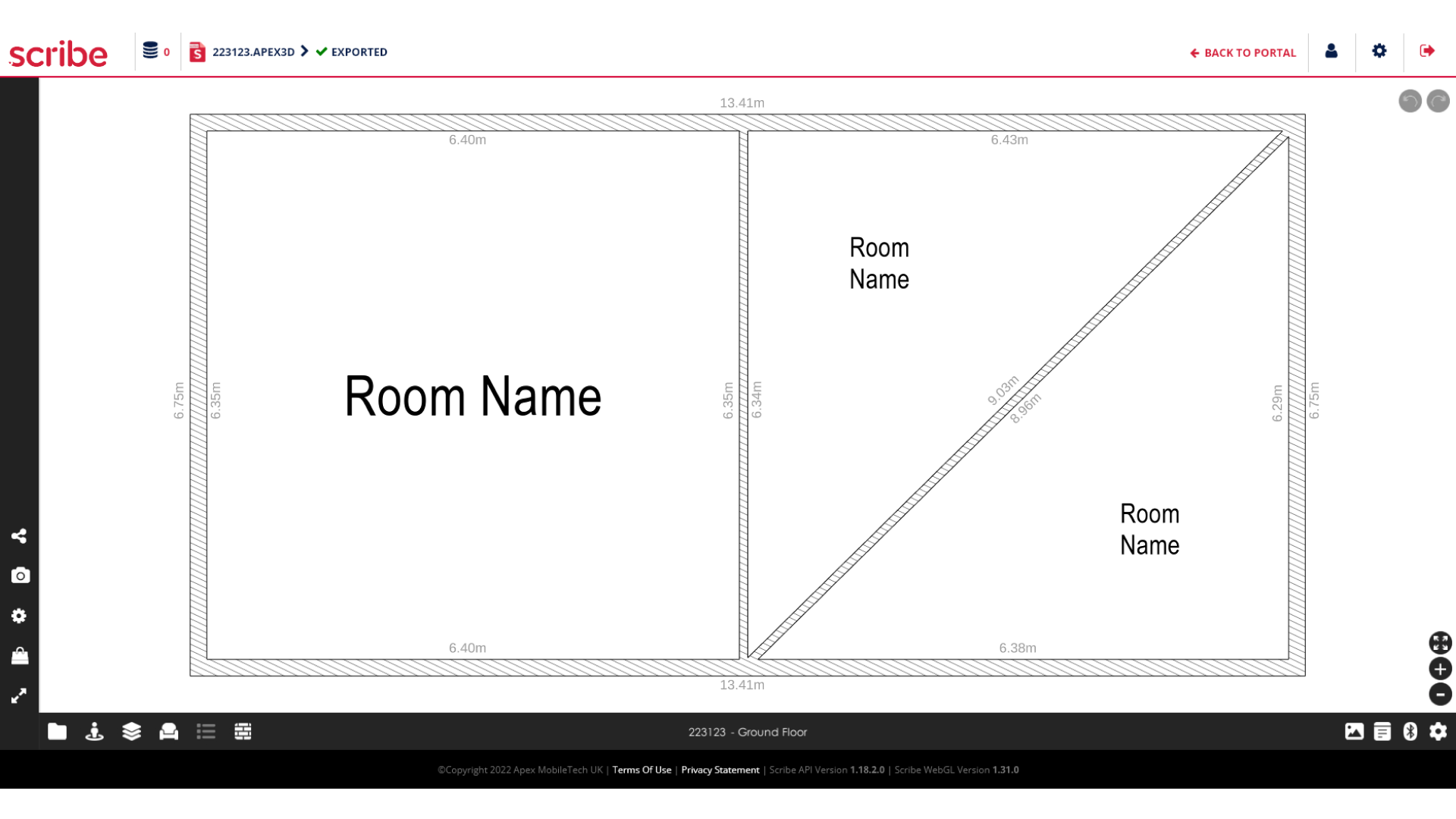
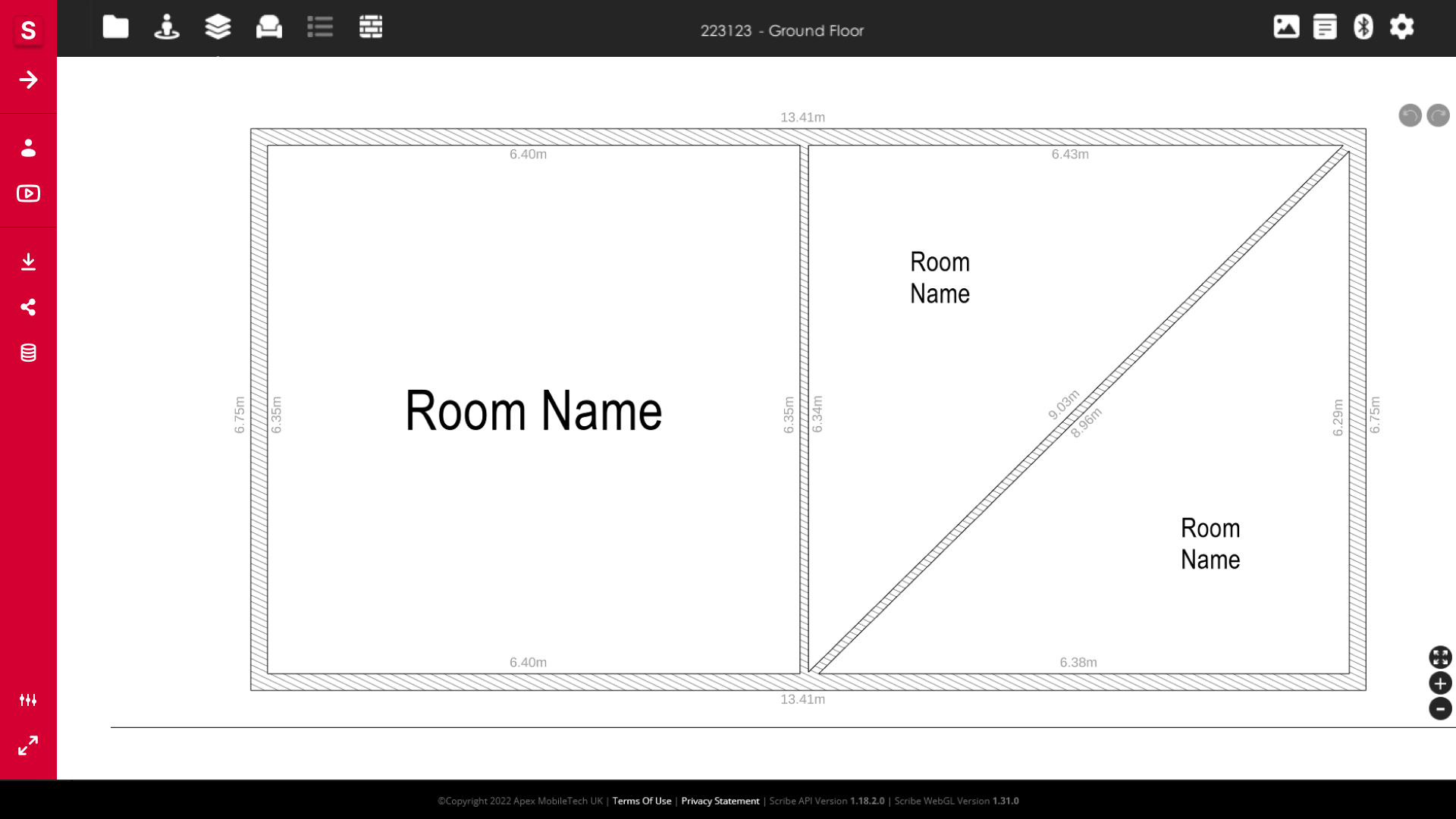
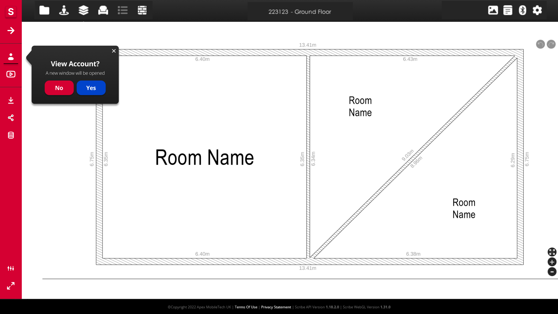
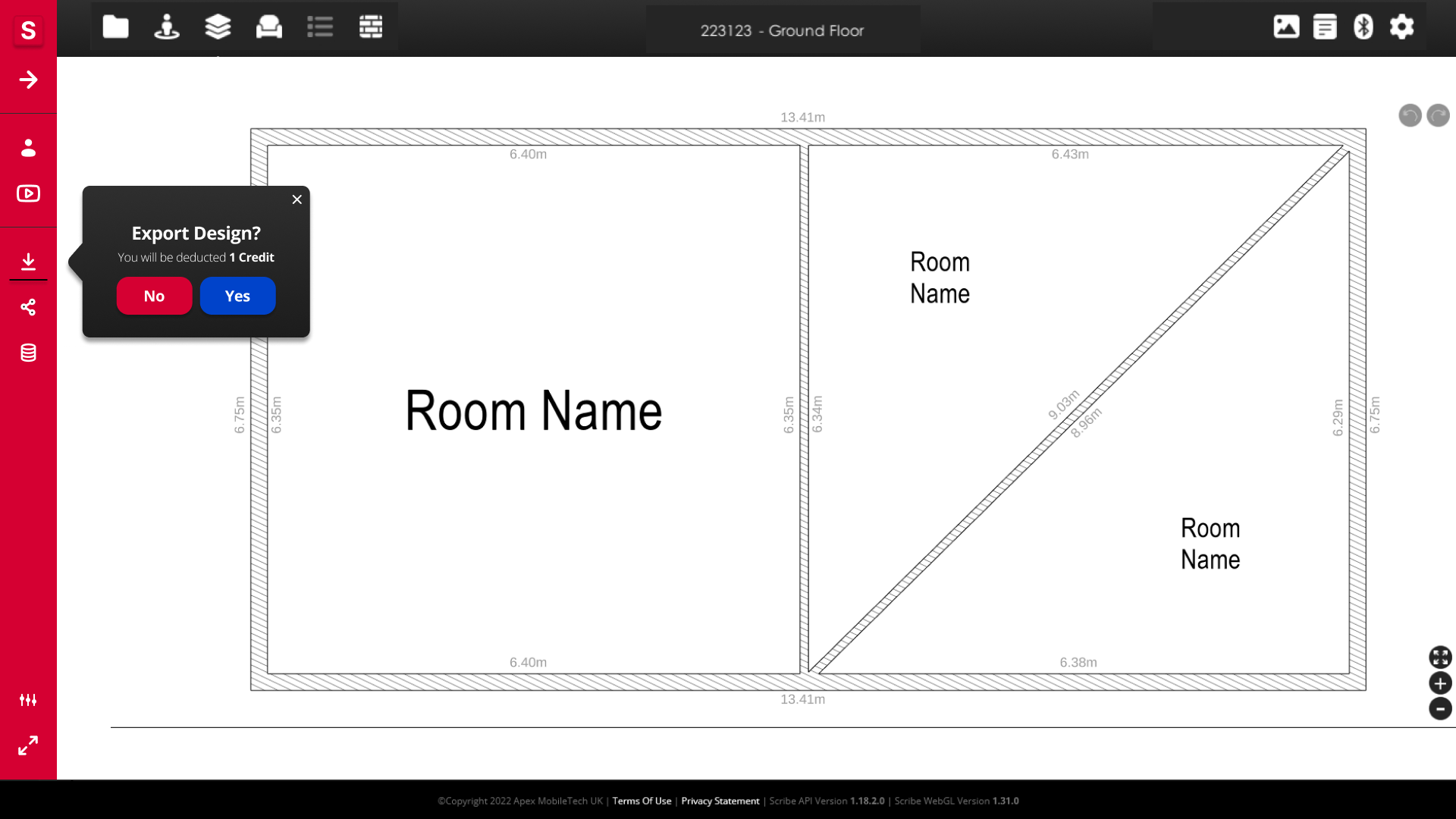
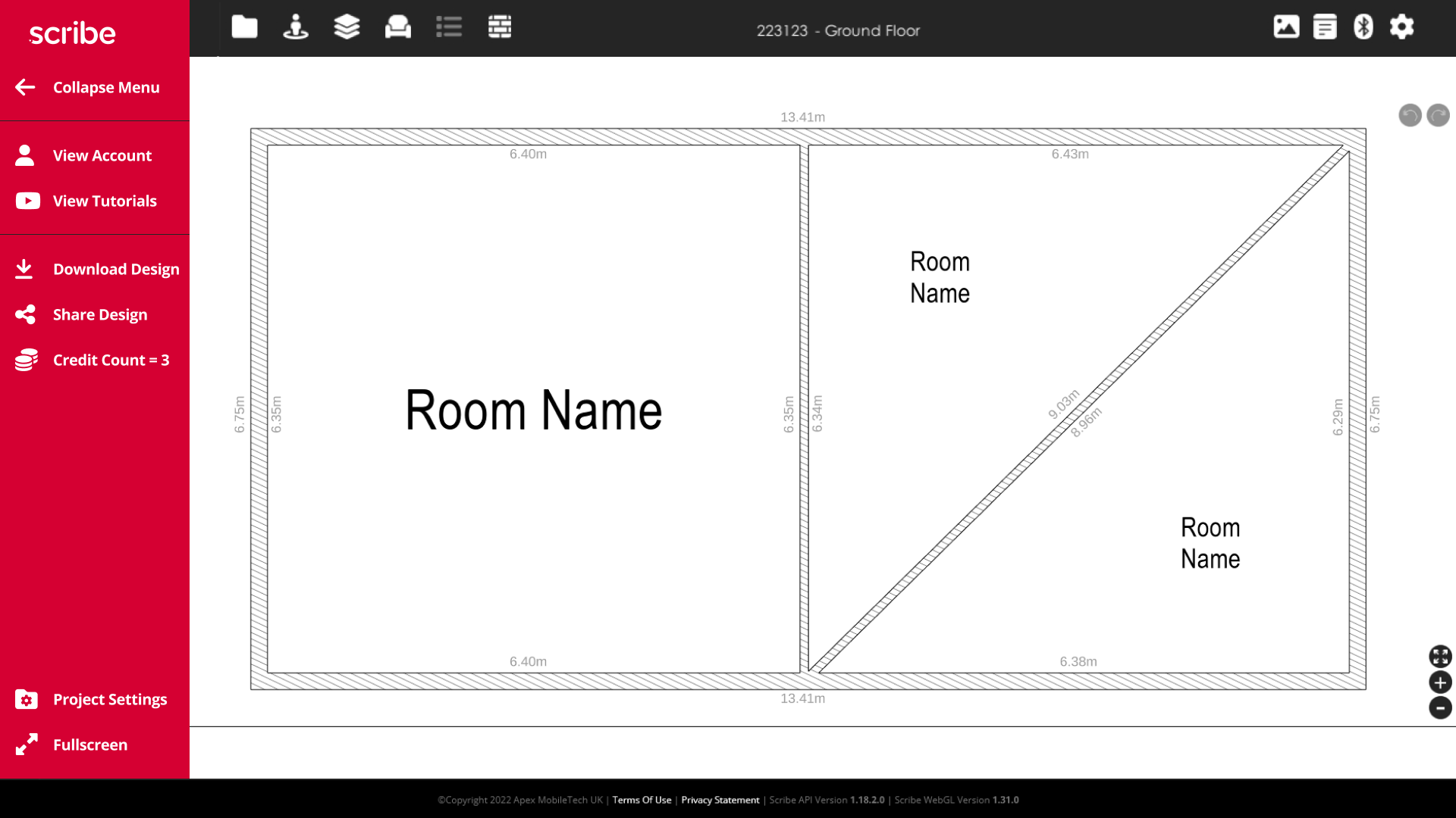
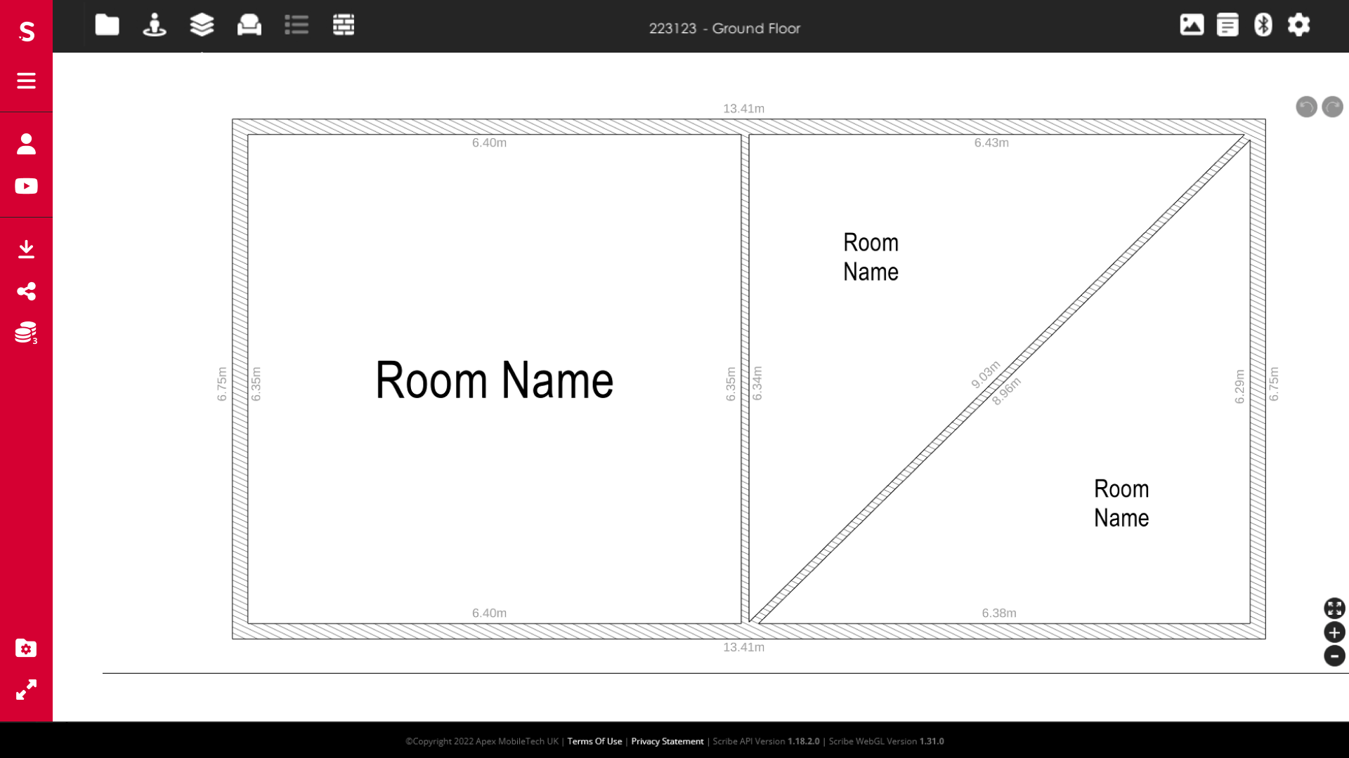
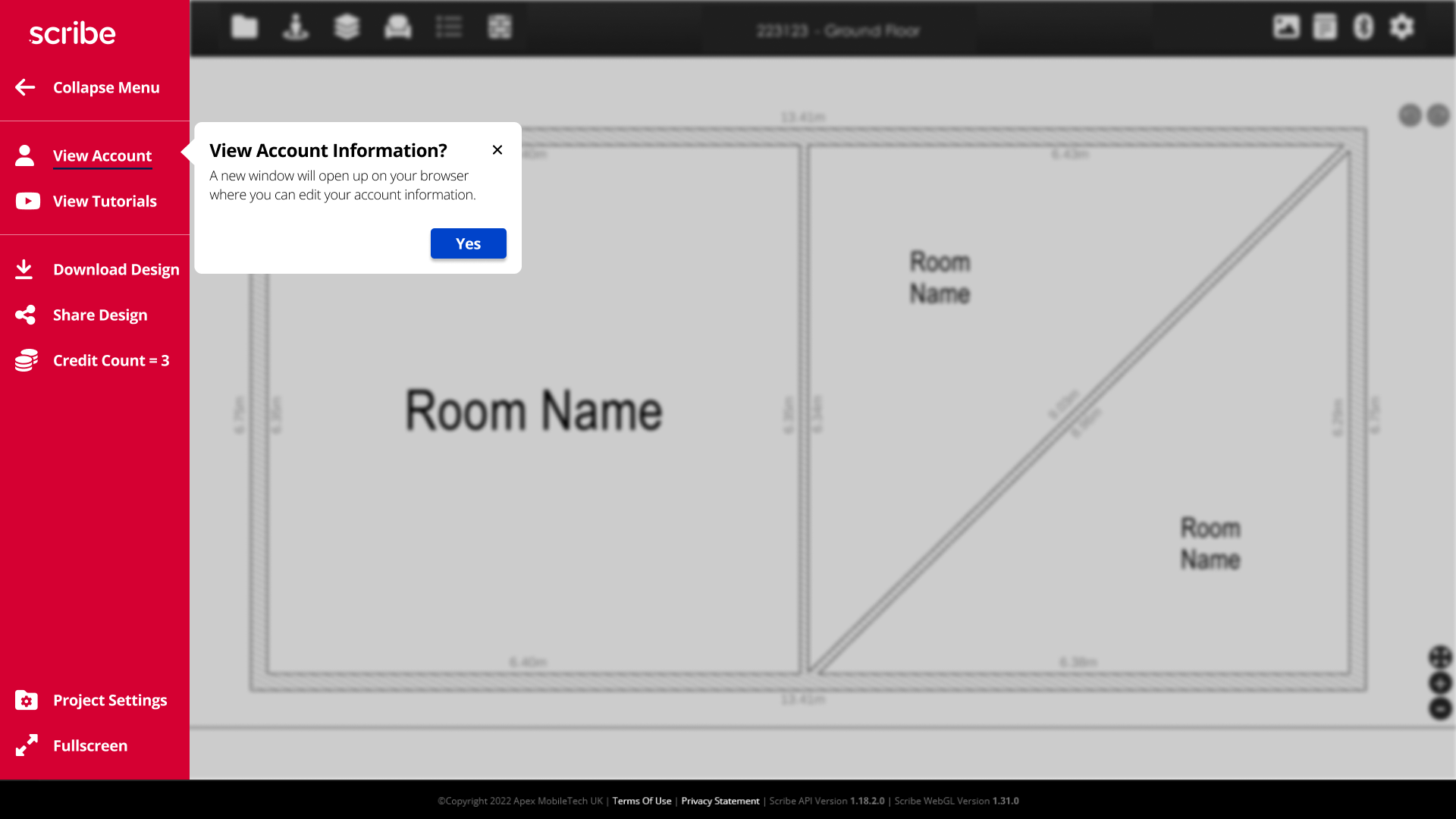
Toolbar and Navigation redesign:
- All webpage icons were moved to the left side of the toolbar
- Icon references had not been provided, so initial ones were selected
- The home bar was kept at the top as it was unclear if it could be replaced at the time
- Popups were minimal at first so as to not distract users, but were found to be too small based on initial research
Our scope for the project and major focus was to take the elements of the web design and figure out what was working best and keep it, then change the other icons and design choices so we could keep the system they already had in place.
The structure of Apex was easily approachable after spending a few minutes with the program, so as a team we just needed to visually communicate those structures in a more simplistic way that new users could understand.
Design Context
Several factors were unknown to the team at the time of initial designs, leading to some initial confusion with the design. These factors the team was unaware of were the following:
- A Developer Version of the software was available with updated colors and schemes that gave a clearer vision of the design
- How much freedom we had to design around the Unity web player
- The ability to take away the top bar completely
- The icon set is used in the Developer Version
Fortunately, as the design lead, I took note of these critical factors and addressed them in our next meeting, which allowed Patrick to provide the exact resources needed and clear up all of these issues. These key elements drastically changed the look of the design in the first versions of the software.
Testing the Design
Key Takeaways:
Users correctly identified what most icons were used for
Some icons were unclear in their usage (mostly deriving from confusion on the Unity toolbar and some icons clashing with the Web icons)
Some things felt too “tight” in the original designs
Pros:
Information was relevant to the users
Overall functions were easy to learn and use
Information was relevant to the users
Overall functions were easy to learn and use
Cons:
Information could feel overwhelming at certain stages
Button layouts were inconsistent and confusing at stages
The bottom bar was poorly designed and the waves were too distracting
Button layouts were inconsistent and confusing at stages
The bottom bar was poorly designed and the waves were too distracting
Version 1 Wireframes


Version 1 Feedback
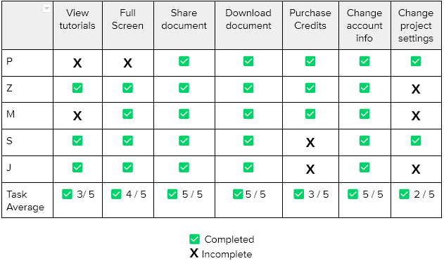
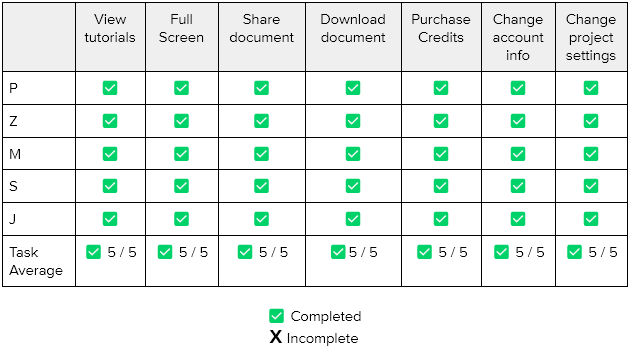
Initial tests were done with mockups in Figma. Five users were asked to navigate through the webpage navigation process and asked for general feedback on how the layout felt, what icons did and what features they may expect from certain areas.
Users noted:
- Easy to navigate
- Some icon confusion
- Straight-forward design once they played around for a little bit
Recommendations:
- Change some of the layout to better fit the overall design scheme
- Give space to some of the popup areas
- Create blur behind popups for larger windows
Final Version Wireframes


Conclusion
Working with Patrick and the rest of my team was a fantastic experience, as we each played to our own strengths and created something that Patrick noted would help greatly with further developing Scribe.
With the wide range of options that Patrick originally presented, we honed in on the best possible solution we could work on and stayed on the task for the most part through the process.
The future:
I look forward to working with more teams in the future, and now have more experience as a project and design lead within a team. Coordinating with Patrick was the most informational aspect of the project, and I know now better questions to ask at the beginning of the project so that we can hit the ground running.
Key takeaway - Working on a team:
Designing with a team was great, as each of us played to our expertise. We had two team members who were far more qualified to handle the User research side, while my background in graphic design made me a clear choice for being project and design lead.
One thing I would like to keep in mind in the future is bringing in the scope of the project, as some members felt insistent on designing elements around the Unity side of Scribe. However, it was not within our original scope and would have delayed our original timeline had me and another member kept our designs focused exclusively on the original scope.