Background- Creating a subscription-based premium service
A startup company launched a media product two years ago. It is a freemium model that has a mobile-web experience and a mobile app for both iOS and Android. The company’s business strategy was to first build a user base by offering a free product and then evolve the feature set so they could monetize on a premium (paid) product. They now need to design an experience that will allow users to subscribe and pay a monthly fee for their services.
The goals for the business are:
- Create the opportunity for new users to subscribe to premium upon registration
- Create the opportunity for returning free users to become premium members
- Create the opportunity for returning free users to become premium members
Pandora, Spotify, Youtube Music, and Bandsintown were all referenced for their user flows for their sign-up process. Each had unique aspects, but almost all followed the key elements of the sign-up process.
Key sign-up flow elements:
- Google, Facebook, and Apple signup option
- Email association
- Music Scan or favorite artist
- Own page for key sign-up actions (email, password, username, etc.)
- Email association
- Music Scan or favorite artist
- Own page for key sign-up actions (email, password, username, etc.)
User personas and research
User Research
Five users were screened from a pool of ten, and interviewed about their choice of music platforms, preferences, and expectations when they are considering a premium product to listen to music with.
What they agreed on:
All users agreed on the following points when asked about a premium product for listening to and exploring new music:
- Must be ad-free
- Recommendations for listening to new music
- Large library and resources
- Customizable playlist
- Easy listening and app design
- Recommendations for listening to new music
- Large library and resources
- Customizable playlist
- Easy listening and app design


The Average Listener:
Music is a part of most days, but it is mostly background music or something to pass the time with. While exploration and some expression can be important, the Average Listener is satisfied with listening to what they know. They relate to music through
- Background sound or in-the-moment listening
- Know what they like, less likely to search out new music
- Want an app/site that is easy to listen with
- Know what they like, less likely to search out new music
- Want an app/site that is easy to listen with
The Music Heads:
Music is a large part of these users' lives. They do not go a day without listening to music, whether that be during their drive to work, during workouts, or just to get in the mindset for their day-to-day actions. These users relate to music by
- Using music as a means of self-expression
- Listen multiple hours a day most days
- Explore new genres, bands, and songs
- Listen multiple hours a day most days
- Explore new genres, bands, and songs
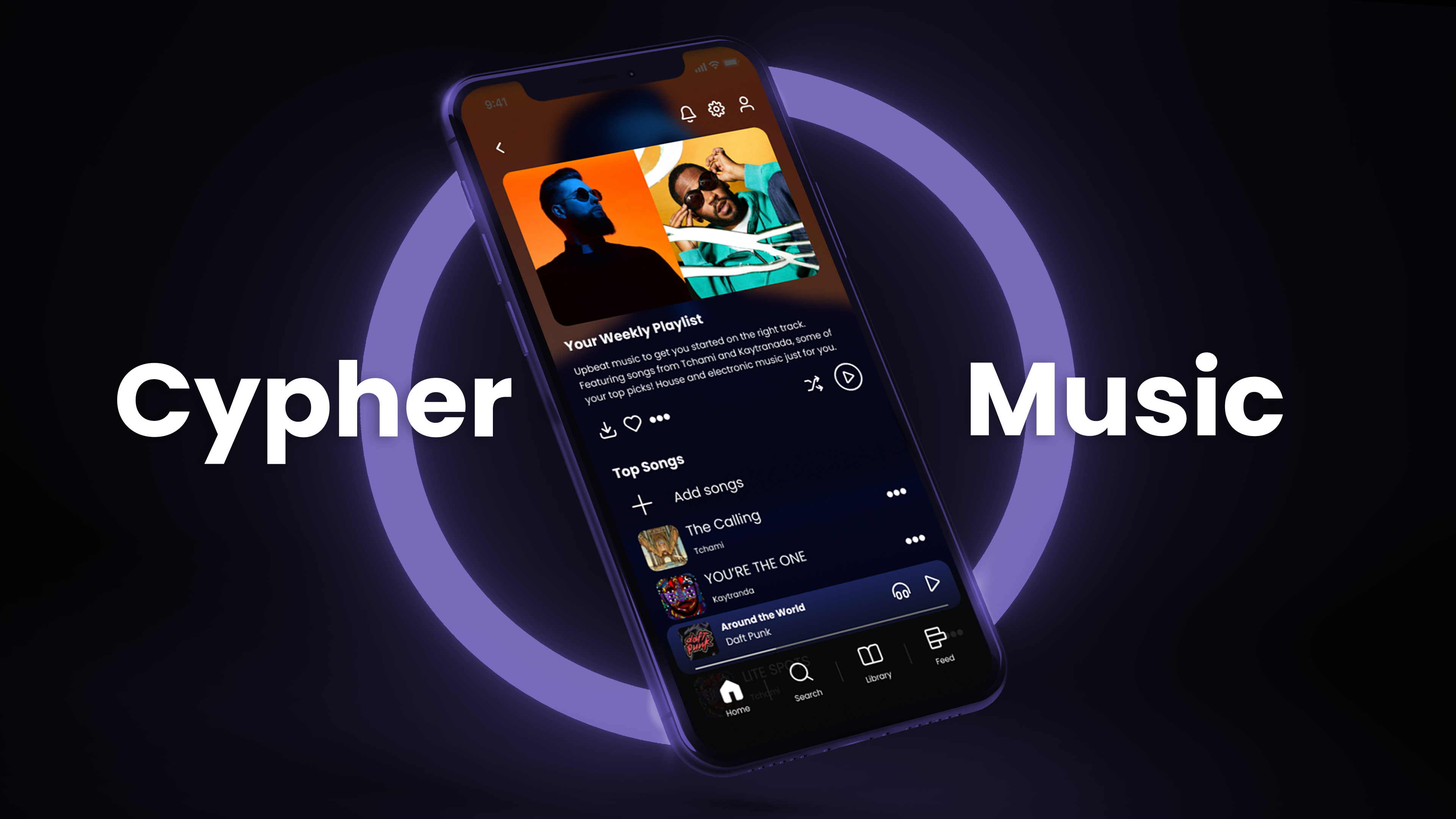
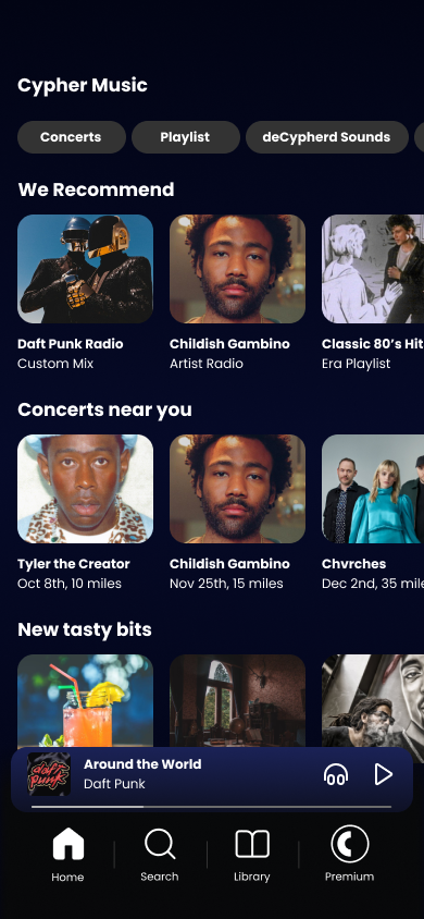
Cypher Music
Unlimited songs, deCyphered for you
High-level goals:
- Design a modern and efficient music software and social platform
- Design a premium sign-up user flow that easily allows users new and old to get a premium account
- Design key features that user research noted as important
- Design a premium sign-up user flow that easily allows users new and old to get a premium account
- Design key features that user research noted as important
Brand origins:
One of the key things that stuck with me during the brainstorming was something that one of the users said during the research period. They brought up that they don’t want to have to search through and decipher all of the music that is available, they want to be able to find music, concerts, and everything easily.
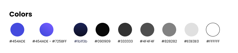
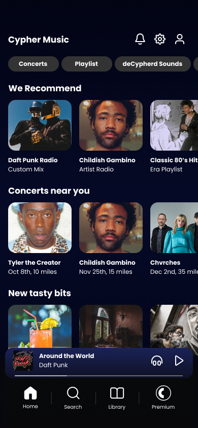
The color schemes were based on a cool, dark theme that is meant to present the music and album covers first, giving the personality of the music and artist a platform that they can more easily express themselves.
Brand design:
The key motifs that stuck out during the design stage included:
- Modern and accessible design
- Inspiring artwork and storytelling
- Ease of use and not overwhelming users
- Inspiring artwork and storytelling
- Ease of use and not overwhelming users
Imagery will be toned and saturated to match the cooler color scheme or keep to an unsaturated black and white. Stock imagery will be less opaque than an album, artist, and song artwork to make sure Cyphers imagery sinks into the background and the music-related images take up the visual presence on the page to promote the artist.
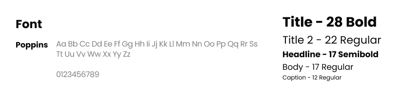
Fonts and colors create a cozy and cool feeling to the app. They are designed to be inviting to the user, while not being too distracting. This is to supplement the idea that bringing the best artist, songs, and news is what is most important to Cypher.
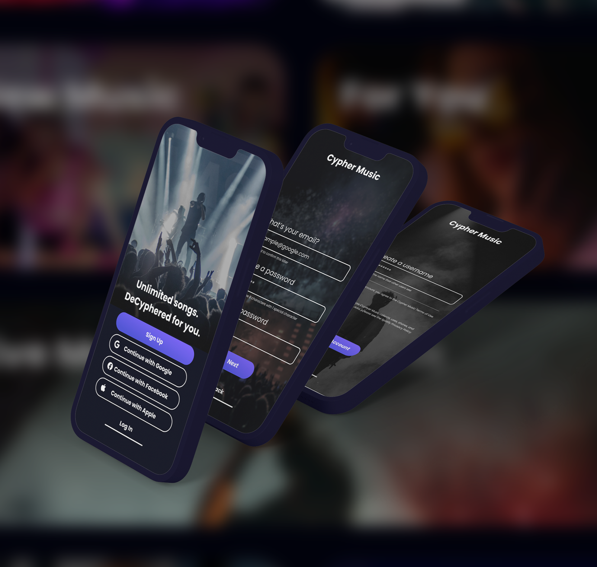
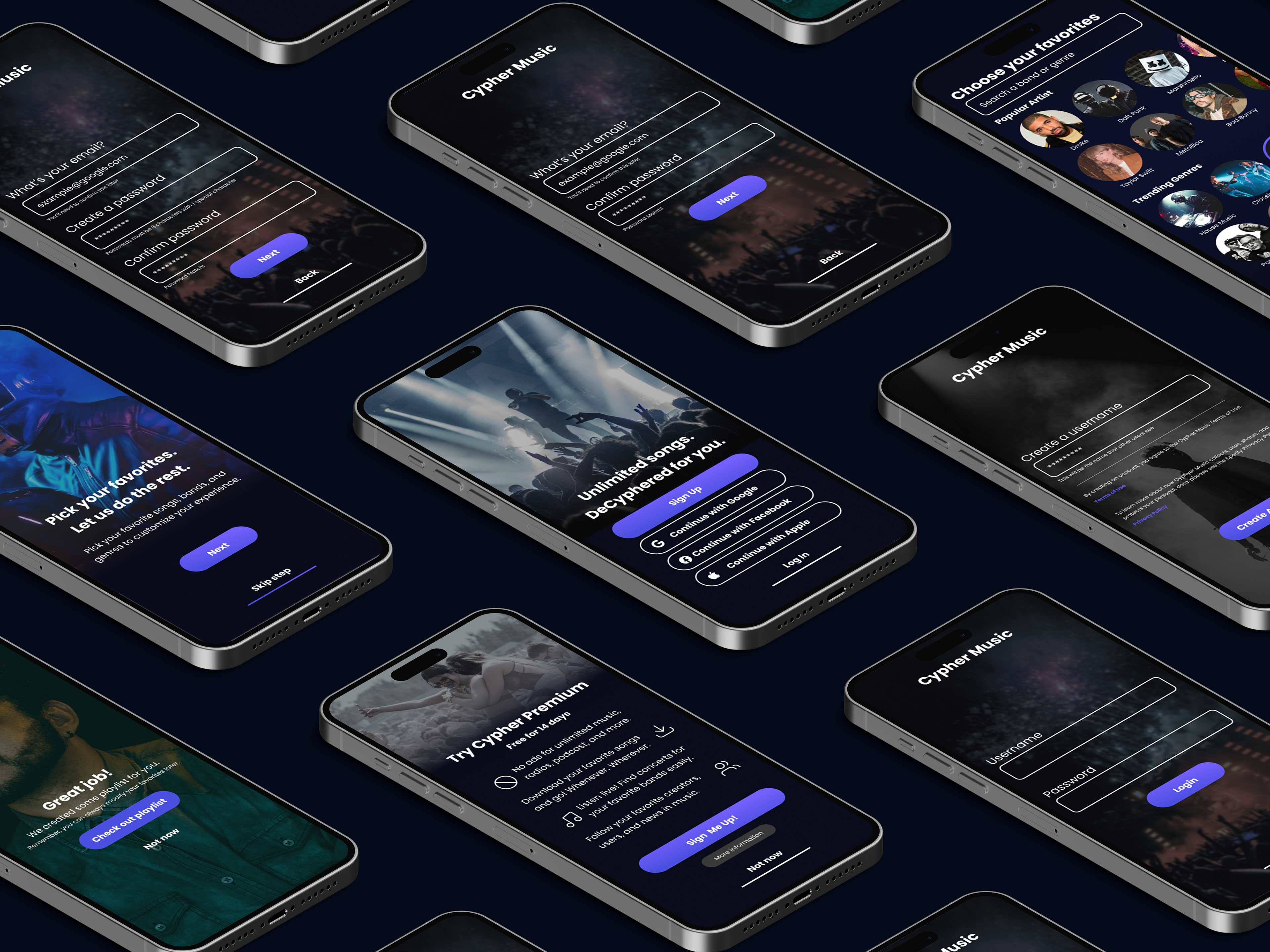
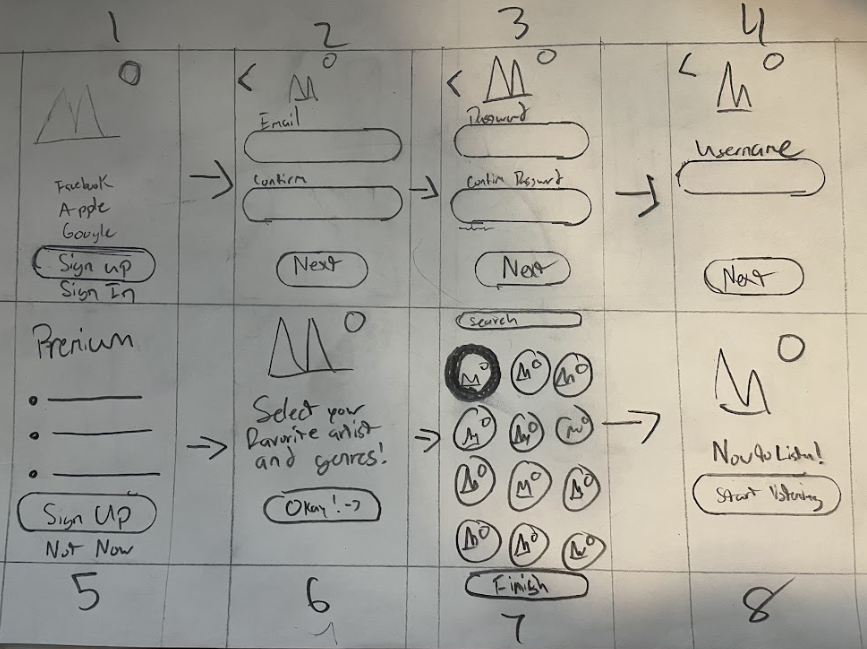
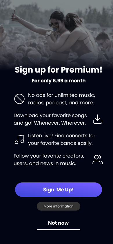
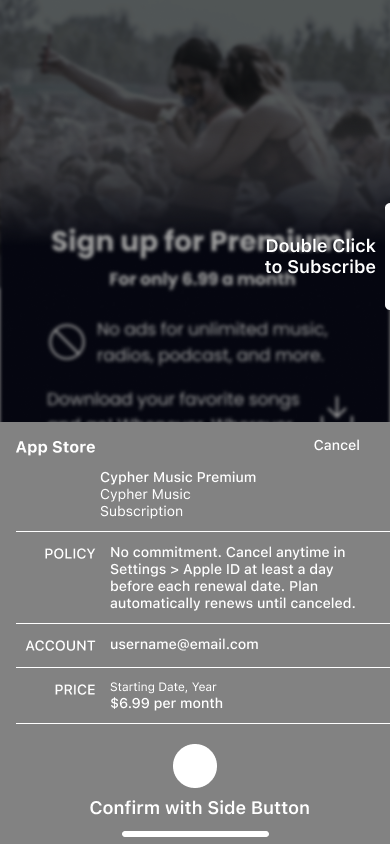
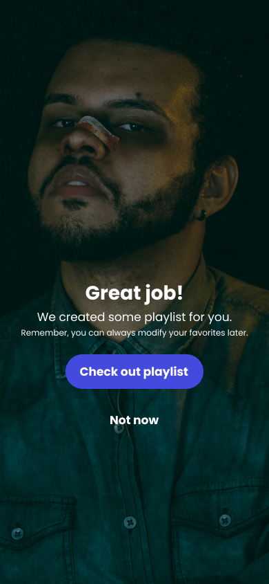
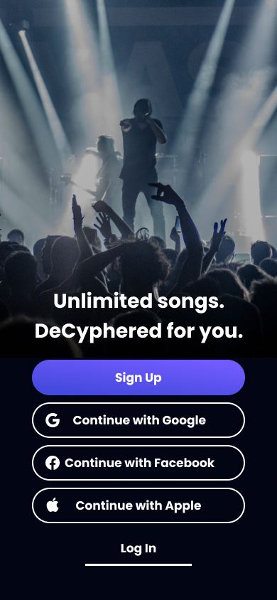
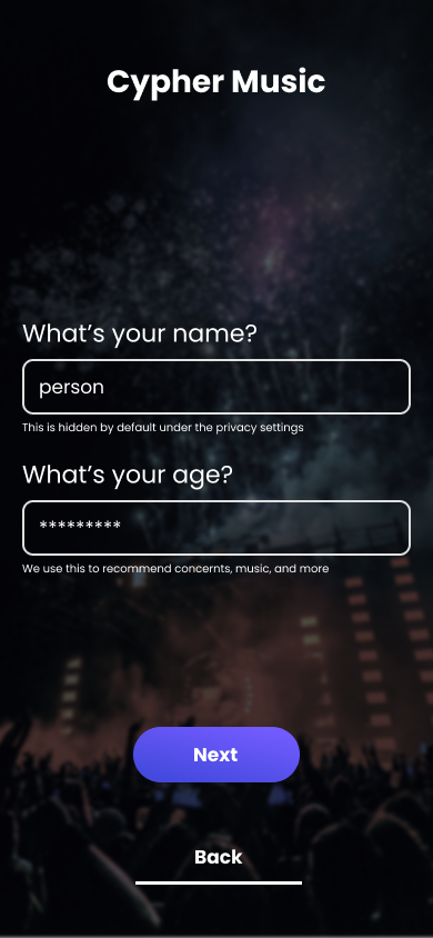
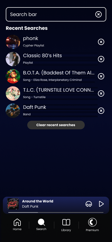
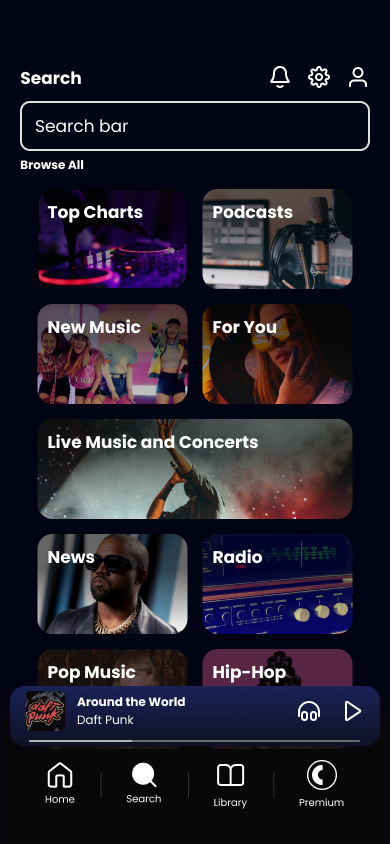
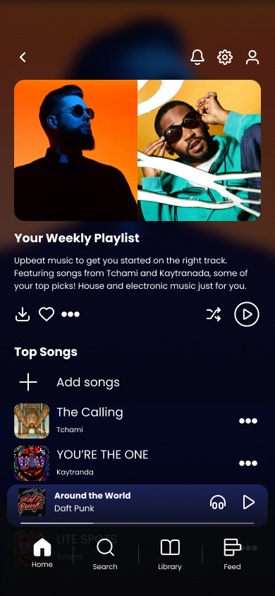
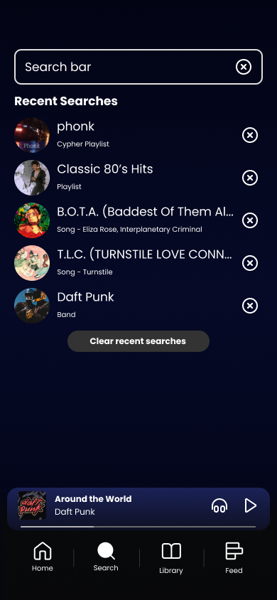
Initial sketches and how the sign-up works:
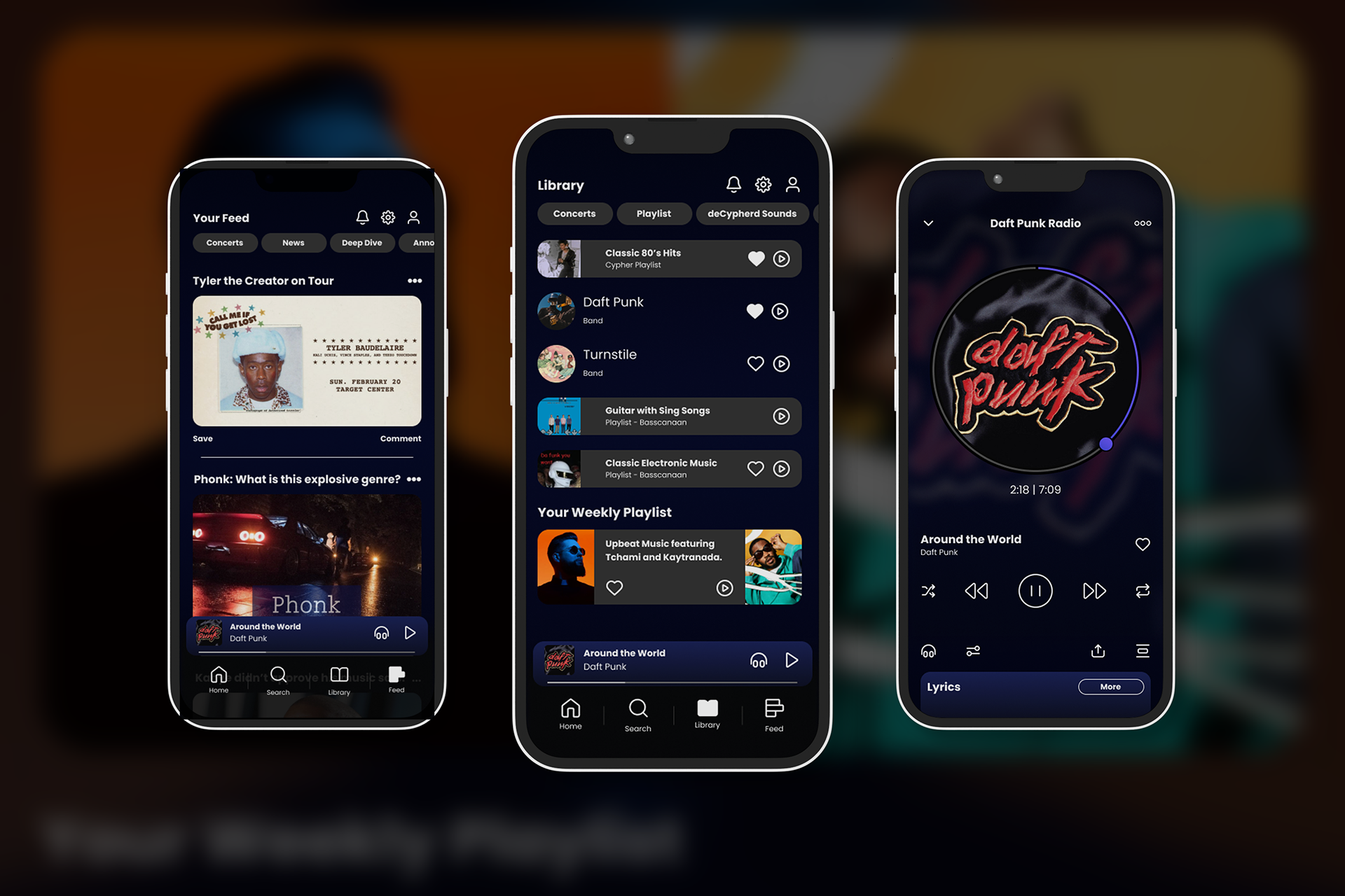
Users choose to login with Facebook, Apple, Google, or an email. Returning users may also sign in and skip straight to the premium screen.
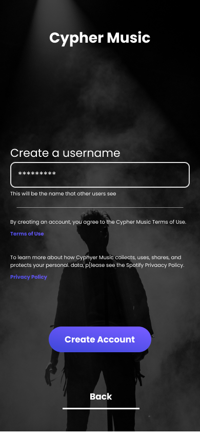
Users input their information and create a username and password.
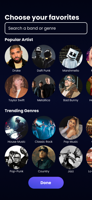
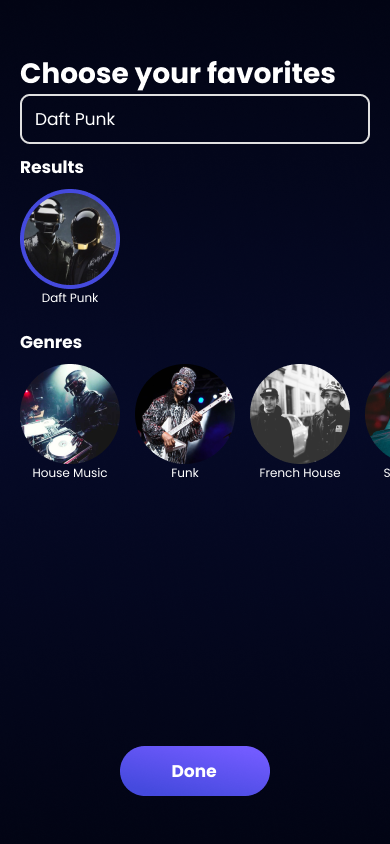
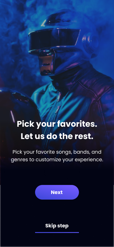
Once all options are filled and the user is presented with the premium option, they can then customize their listening experience by searching their favorite artist, songs, and genres.

Prototyping and Design
Guerrilla testing:
Initial tests were done with the low-fidelity mockups in figma. Five users were asked to navigate through the sign-up process and were asked for general feedback on how the layout felt, and what features they may expect.
Users noted:
- Easy to navigate
- “Felt familiar”
- Straight-forward and minimal design
- “Felt familiar”
- Straight-forward and minimal design
Recommendations:
- Remove “song” as a searchable option on sign-up
- Detail further aspects of what is happening at each step
- Detail further aspects of what is happening at each step
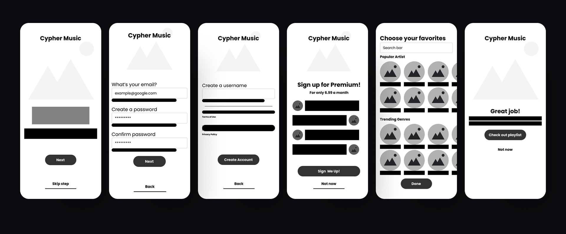
Version 1 - Hi-Fidelity wireframes:


Version 1 feedback:
Users noted:
- Easy to navigate
- “Felt familiar”
- Cool and cozy feeling design
- Easy to find and use things that are “new” to the user (such as icons, search, etc.)
- “Felt familiar”
- Cool and cozy feeling design
- Easy to find and use things that are “new” to the user (such as icons, search, etc.)
Recommendations:
- Sign-up details need to be more clear
- Some icons unclear
- Design artist page and music player for feedback
- Some icons unclear
- Design artist page and music player for feedback
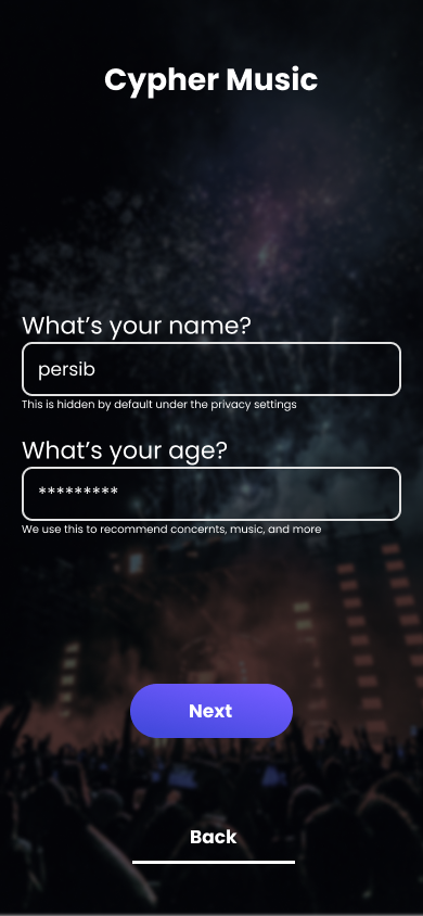
Imagery and example text was filled into the designs, bringing further life to the design. A background texture, uniform buttons, and imagery were all experimented with at this stage and created a more uniform look for the app as a whole.
Pros:
- Clear navigation
- Easy interaction
- A decent understanding of the creation tool
- Easy interaction
- A decent understanding of the creation tool
Cons:
- Colors are clashing
- Feels flat/undesigned in areas
- Still unclear on some of the creation tool
- Feels flat/undesigned in areas
- Still unclear on some of the creation tool
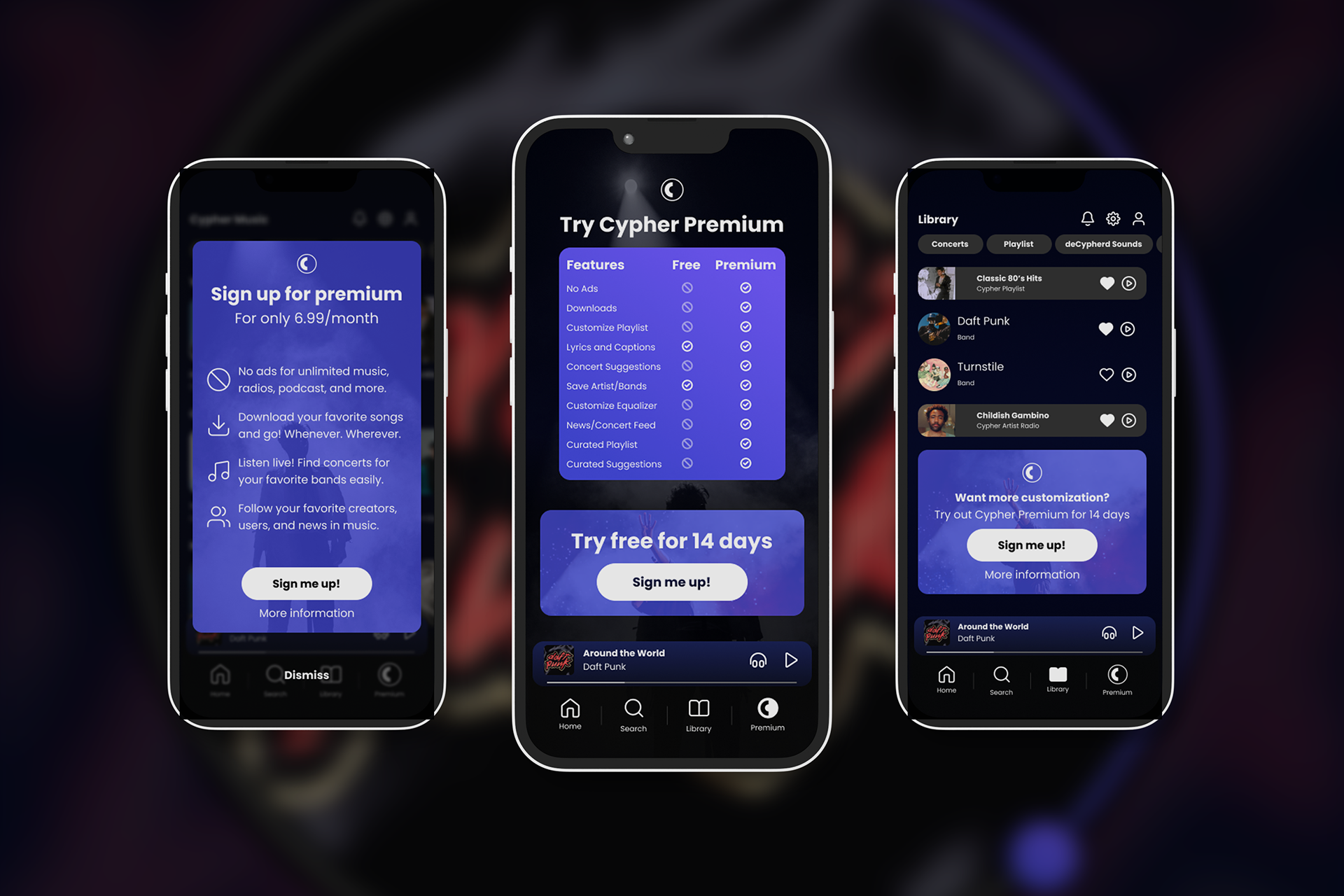
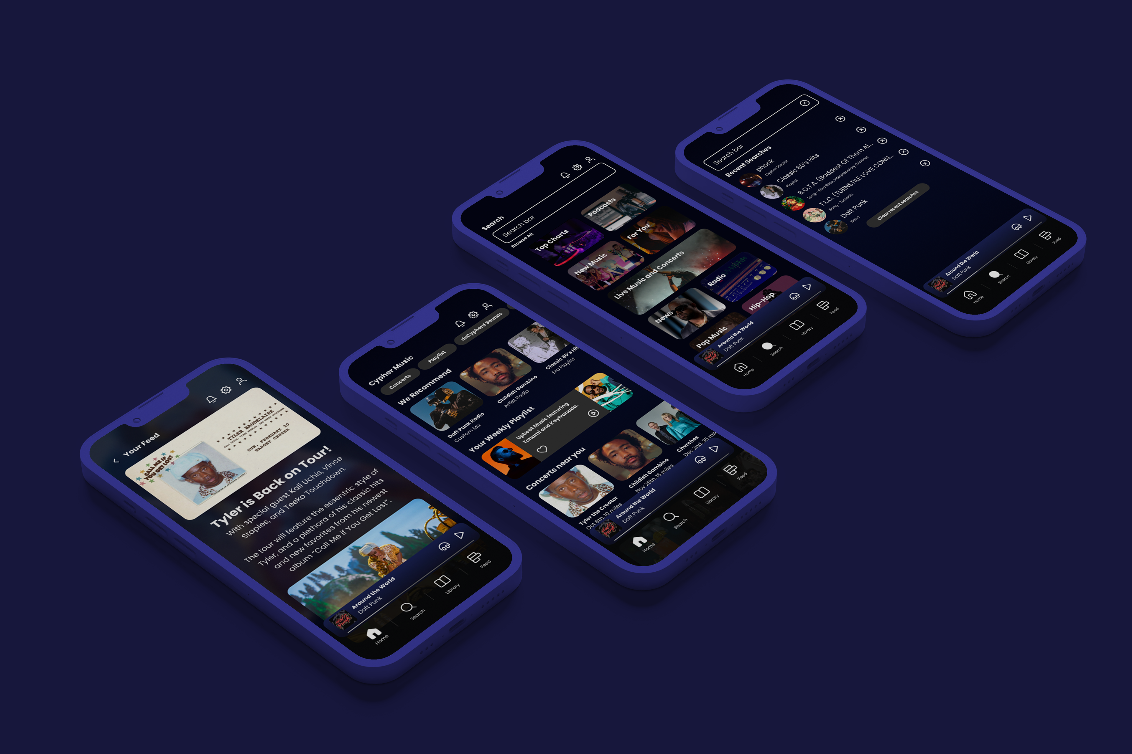
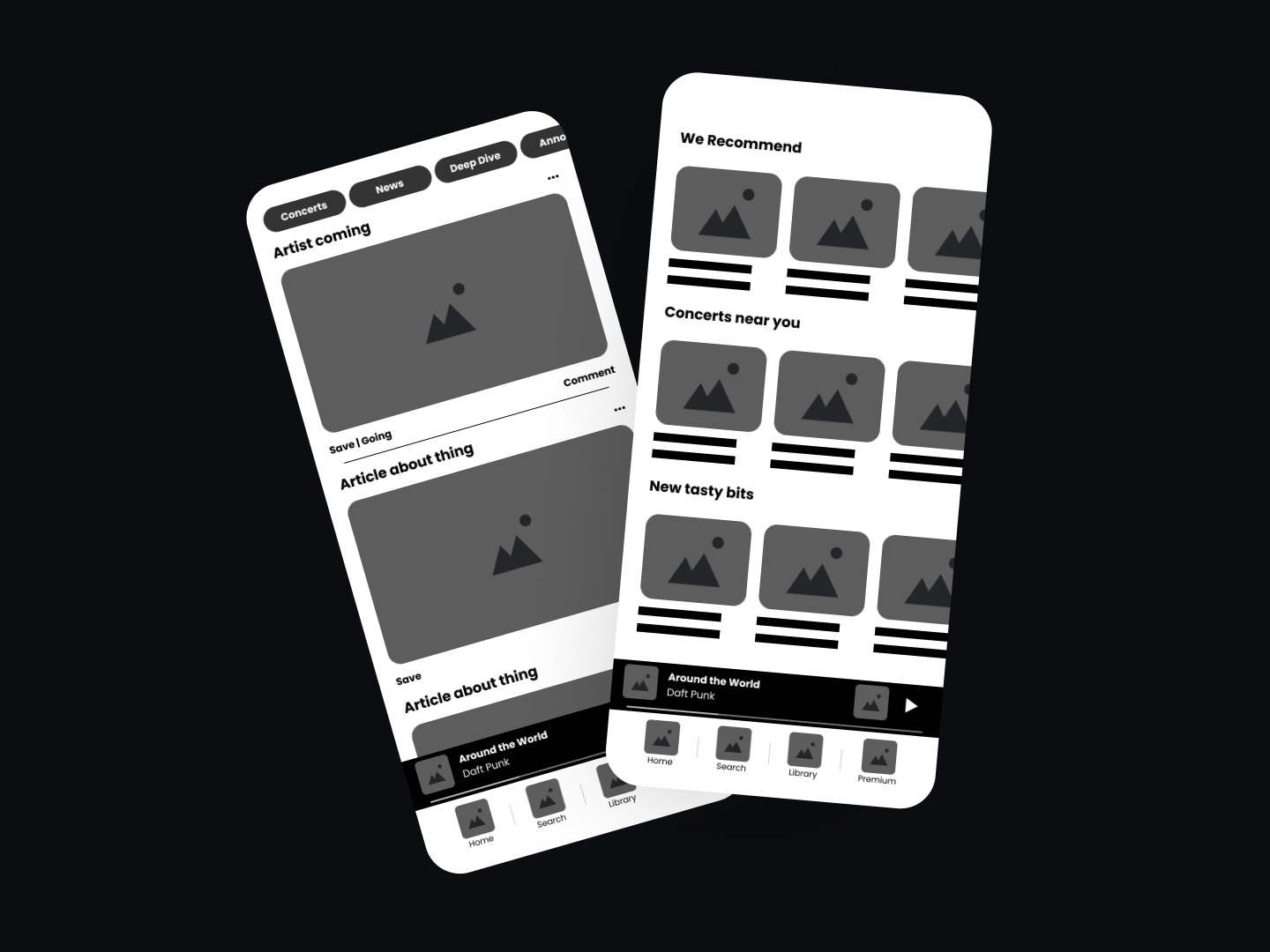
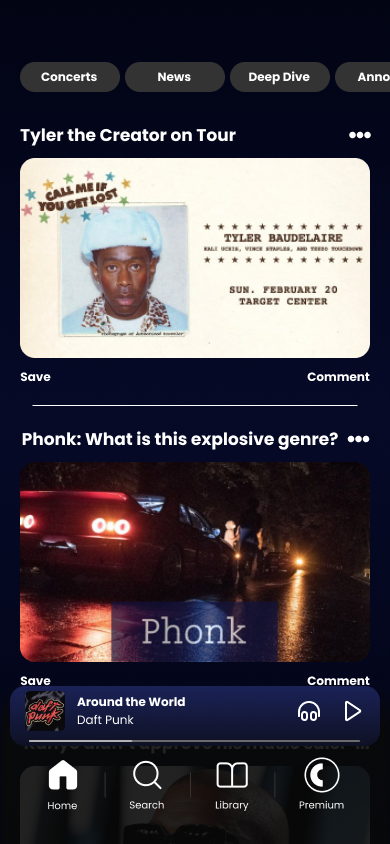
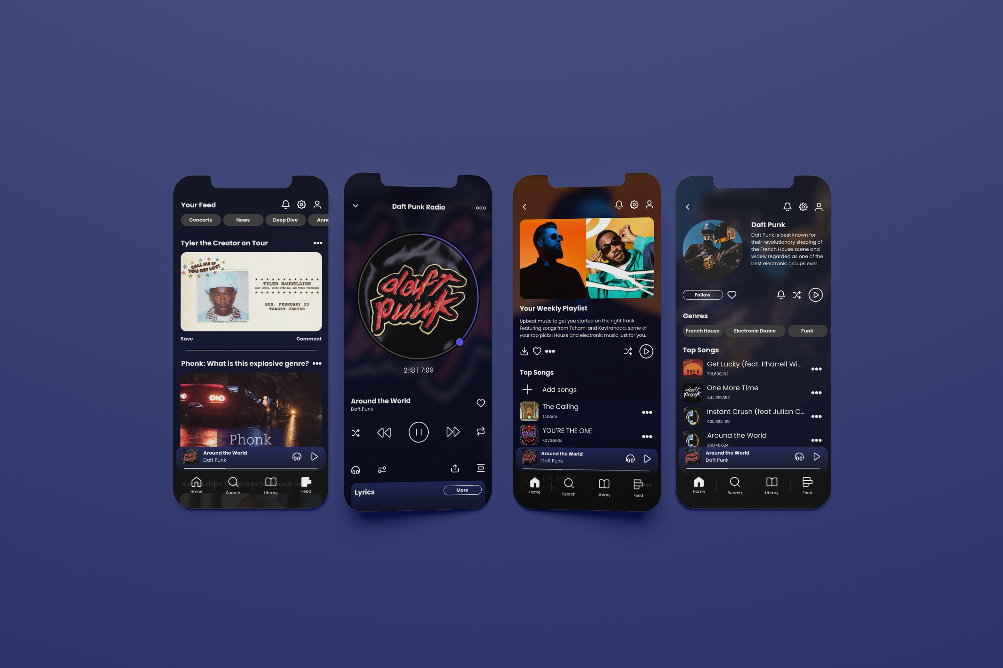
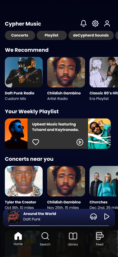
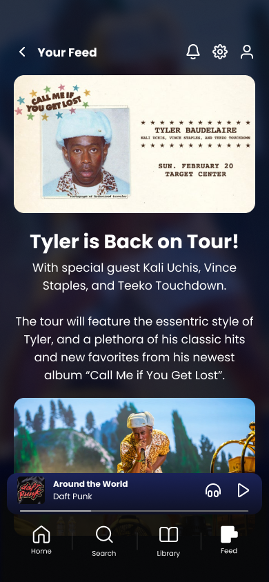
Final Version - Hi-Fidelity wireframes:


Conclusion:
Cypher music was an interesting design challenge as someone who wants the most out of their music listening applications. I think that the feed design, artist pages, player design, and premium features that were created are things that I would want in a player, and I found that other users wanted them as well.
It was great to see how different users react to the app, as well as the premium page layouts that detail the information of a premium service.
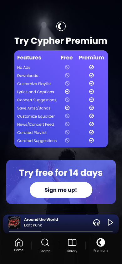
Key takeaway - Premium Service Design:
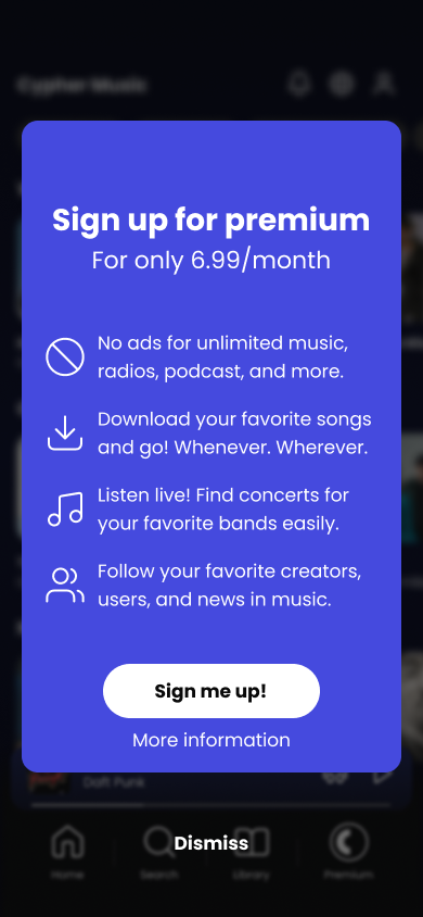
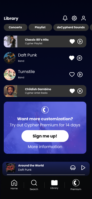
Designing for a premium feature was extremely informational, as the design challenges shift to informing your consumer base and pushing them towards a premium model of the product. It is important to balance information overload with contrasting the vast differences that make the premium features more worthwhile.
Often times premium pushes can feel invasive and unwanted, but I believe a good balance was struck with the occasional popup and premium page that was designed in this challenge, as was confirmed by the users who gave feedback on the final rounds of testing.
The future:
When I revisit this design, I plan on expanding on the options and features of the app. While the app does have a good base design for everything, many features such as menus, customization options, and other aspects of music player apps need to be updated.
Additionally, I would like to design a “creators” tab, where people can write or post their own blogs or opinions on music, artists, concerts, and everything in between. This would be a great feature that could expand the feed page and give life to the app through community participation.