Design Brief
PostUp is a new startup where freelancers and remote workers share tips and advice. Recently, PostUp has seen lots of feedback and discussions about how to find good public places to work from.
PostUp wants to make it easier for remote workers to find great public places to work, have meetings, and take calls. The goal of the design is to enable users to easily find a place that meets their unique needs when they work outside of the office space.
Design Constraints:
- The design must be a mobile app
- PostUp wants to help users find a place that already exists
- PostUp will be a subscription service
- PostUp wants to help users find a place that already exists
- PostUp will be a subscription service
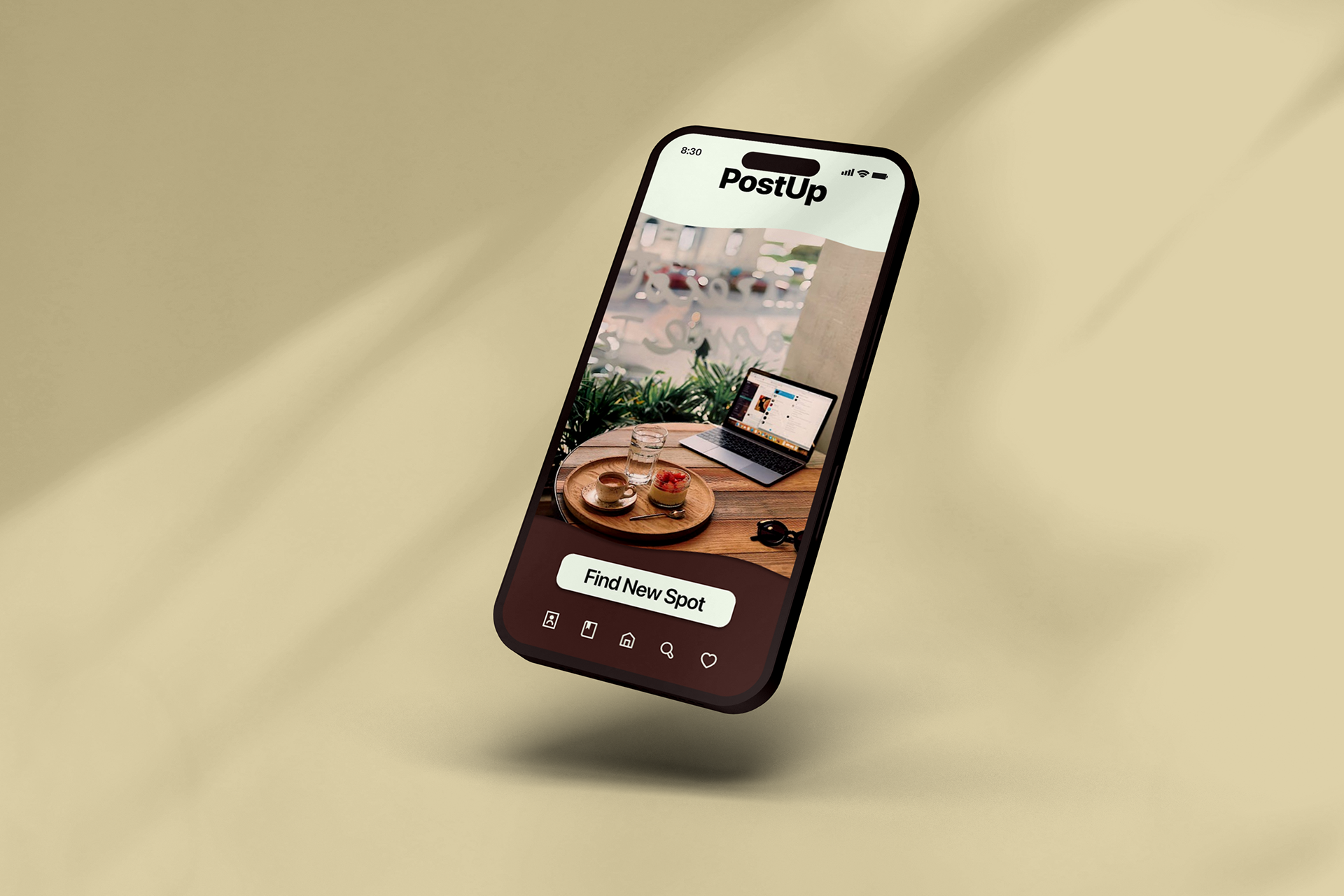
For this project, the mobile app was developed for iOS devices in mind first, with plans to redesign for Android with material design in mind.
Mapping the course (Day 1):
Project Details
User research was provided by PostUp, and key feedback from users was that they needed a way to narrow their field of view when looking through other mapping sites or public listings for coffee shops, libraries, and more.
One of the most common pieces of feedback was that current solutions are targeted toward the general public, and do not include the specific needs that remote workers need. This can lead to users wasting time searching through reviews, information, and multiple locations just to find one that sometimes fits their needs.
Key elements users search for when deciding:
- Access to wifi
- Large rooms or availability
- Limited crowds
- Work-friendly environments
- Large rooms or availability
- Limited crowds
- Work-friendly environments
Users also noted several smaller considerations such as if a place allows longer working times, access to food/drinks, or whether they could hold meetings/phone calls at a specific location.
User flow guideline:
The general design of the user flow was established on the first day so that designs that followed would all fit within the criteria that user research had found.
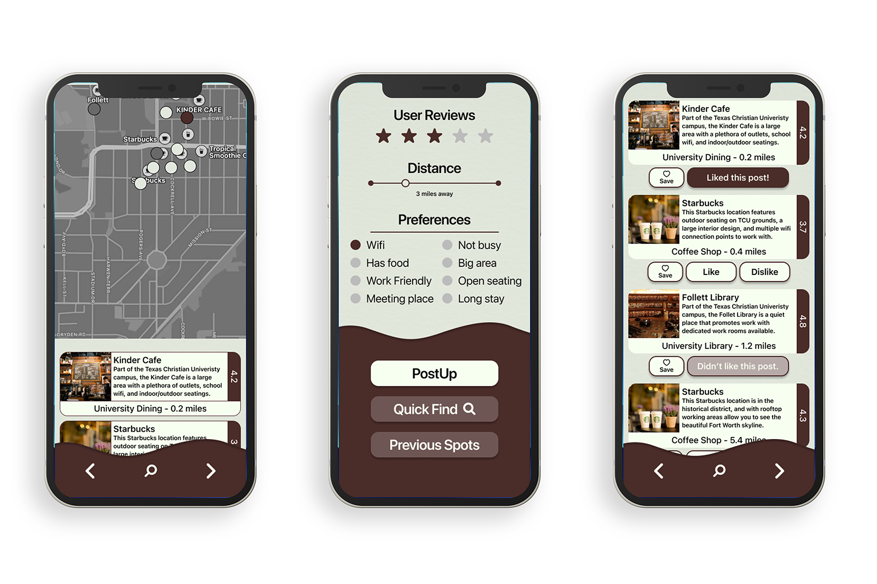
1) Users first require a space
2) Users will open the app while the app finds their location
3) User will select their preferences
4) The app will show potential destinations based on preferences
5) The user looks through the selected destinations
6) User will select a location and the application with open preferred mapping app for directions
7) The user arrives to the location to begin work
Research and sketching (Day 2):

The second day began with determining what competitors were doing. The most notable competition to PostUp is big-name mapping apps such as Apple Maps or Google Maps. With these apps, users can search key terms such as coffee, library, or park and find places around them. Additionally, more specific apps that focus on coffee shops or libraries exclusively were also considered when viewing other apps.
Key take aways on Apple/Google Maps
- Clear, modern design that prioritizes location first, then info such as whether it is open, how far it is, overall ratings
- Image spread from Yelp if a food-based location, or public images in other cases
- Packed with a plethora of information for most locations such as website, user reviews, amenities and accessibility information, and details about how to contact the specific location
- Image spread from Yelp if a food-based location, or public images in other cases
- Packed with a plethora of information for most locations such as website, user reviews, amenities and accessibility information, and details about how to contact the specific location
Key take aways on other apps
- Poor design and does not follow Human Interface guidelines
- Designs feel old and clunky
- Poor information structure
- Designs feel old and clunky
- Poor information structure
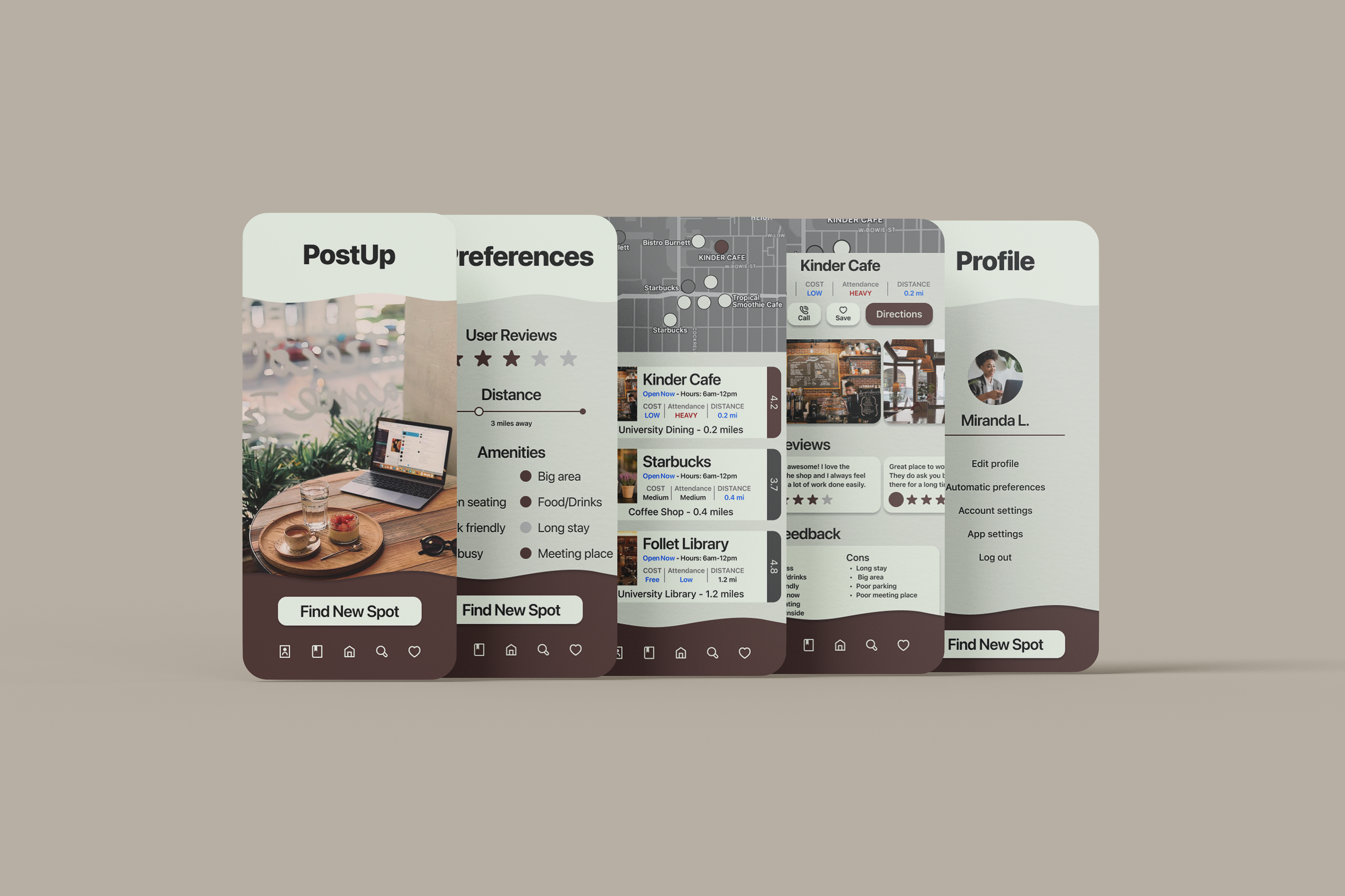
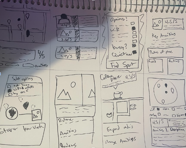
Initial sketching:
Initial sketches were completed following the Crazy 8’s method, with a focus on the design layout and development of elements for the app in multiple design types.
Branding and sketching (Day 3):
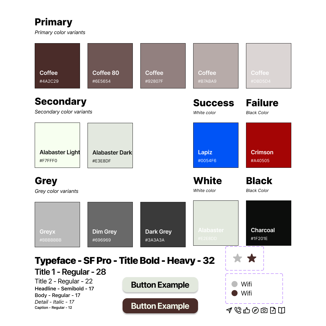
Key brand elements:
- Cozy and modern design that reminds users they are finding a spot to relax and work
- Neutral color palette that supplements information without distracting the user
- Ease of use and familiarity
- Neutral color palette that supplements information without distracting the user
- Ease of use and familiarity
Design Philosophy:
Since this app was designed with iOS devices in mind first, the Human Interface guidelines were followed.
Font:
The font family chosen was SF Pro, as it is minimal, readable, and is essential to the Human Interface guidelines
Colors:
The final design colors were chosen to mirror coffee-like colors, with the Coffee brown being the main color, and different shades of Alabaster were used as an off-white for buttons and text.
Additionally, these colors were chosen to promote the sense of a cozy, retro design that would help separate the brand from other competitors that were bright and busy, or the Apple and Google designs that were grayish-neutral.
Imagery:
Images were pulled from non-copyrighted resources and should be used to remind the user of what the end goal of the app is for, finding the perfect spot to work comfortably and focus on what matters to them.

Testing (Day 5)
Five users were contacted on the first day of the design sprint and were selected with the criteria that they are currently working in a field that may require them to find public places to work, or if they are a student that may need to find a place to work.
Testing Parameters:
Users were instructed that the PostUp app is directed towards users that would need to find a public place to work, hold meetings, or any other specific needs that one might have when working/studying remotely. They were prompted to explore the app freely and describe what they see as they progressed through the system.
Users were monitored during their exploration of the application, and at the end they were asked questions to summarize their overall experience.
Wrap-up questions:
How do you feel when using the app?
Would you find use in the functions this app provides?
What parts work for you or stand out to you about the app?
What parts frustrate you or cause difficulty in the app?
What features would you like to see improved upon or added?
Would you find use in the functions this app provides?
What parts work for you or stand out to you about the app?
What parts frustrate you or cause difficulty in the app?
What features would you like to see improved upon or added?
User feedback:
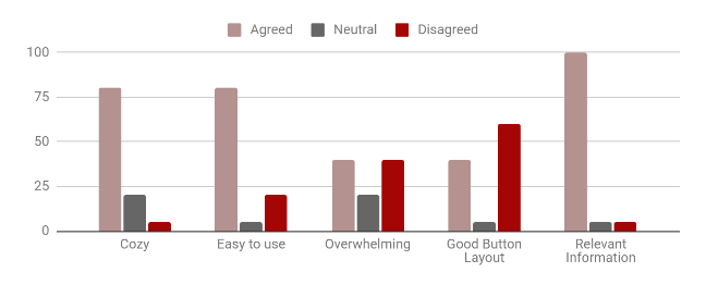
Users agreed that the brand and app design felt cozy, with some commenting that there was a “modern retro” look to the design that was pleasing. Additionally, users commented that there was a sense of familiarity with the design which made most users feel that the design system was easier to learn.
Users disagreed on the button layout, with many commenting that the bottom bar of buttons did not match the rest of the design and that the wavy lines were too large and didn’t fit well overall. Additionally, users commented that some of the information felts packed together, especially on the navigation spread where the options of the Kinder Cafe, Library, and Starbucks gave them a sense of information overload.
Redesign goals from user feedback:
- Redesign splash information about a location so it doesn’t feel crowded
- Remove buttons for other pages and replace them with icons
- Redesign bottom navigation and reduce wavy box height
- Add subscription, profile, and secondary pages
- Remove distracting lines from pages
- Increase space between elements
- Remove buttons for other pages and replace them with icons
- Redesign bottom navigation and reduce wavy box height
- Add subscription, profile, and secondary pages
- Remove distracting lines from pages
- Increase space between elements
Pros:
The design felt “cozy” with a sense of “modern retro” design
Information was relevant to the users
Overall functions were easy to learn and use
Information was relevant to the users
Overall functions were easy to learn and use
Cons:
Information could feel overwhelming at certain stages
Button layouts were inconsistent and confusing at stages
The bottom bar was poorly designed and the waves were too distracting
Button layouts were inconsistent and confusing at stages
The bottom bar was poorly designed and the waves were too distracting
Reflections and final designs
The design sprint was a great way to put design skills to the test in a quick-paced environment, and I enjoyed the challenge of creating a working prototype within a week. In future cases, I would trade off the few hi-fidelity wireframes in this design sprint for many more lo-fidelity versions. This would help because it could give a greater sense of how the user is interacting with the app, and lead to a stronger sense of what needs to be done to increase user attentiveness and address user needs while using the app.